Article

Uncertainty in Geographic Data on Bivariate Maps: An Examination of Visualization Preference and Decision Making

Department of Geography, Texas State University, San Marcos, TX 78666, USA
*
Author to whom correspondence should be addressed.
ISPRS Int. J. Geo-Inf. 2014, 3(4), 1180-1197; https://0-doi-org.brum.beds.ac.uk/10.3390/ijgi3041180
Submission received: 31 July 2014 / Revised: 13 October 2014 / Accepted: 13 October 2014 / Published: 24 October 2014
(This article belongs to the Special Issue Recent Developments in Cartography and Display Technologies)

Abstract

:
Uncertainty exists widely in geographic data. However, it is often disregarded during data analysis and decision making. Proper visualization of uncertainty can help map users understand uncertainty in geographic data and make informed decisions. The study reported in this paper examines map users’ perception of and preferences for different visual variables to report uncertainty on bivariate maps. It also explores the possible impact that knowledge and training in Geographic Information Sciences and Systems (GIS) may have on map users’ decision making with uncertainty information. A survey was conducted among college students with and without GIS training. The results showed that boundary fuzziness and color lightness were the most preferred visual variables for representing uncertainty using bivariate maps. GIS knowledge and training was found helpful for some survey participants in their decision making using bivariate uncertainty maps. The results from this case study provide guidance for reporting uncertainty on bivariate maps, aiming at encouraging informed decision making.

1. Introduction

Uncertainty is resulted from not knowing the exact degree of the discrepancy between geographic data and the geographic reality which these data are intended to represent. The quality of geographic data is affected by positional, attribute, or temporal accuracy, consistency, completeness, or lineage [1,2]. Limitation in human knowledge and capacities, instruments, analysis techniques, and the financial budget can all introduce uncertainty into geographic data. Uncertainty can be propagated or amplified during the process of data management, analysis, and visualization. Despite the fact that uncertainty exists widely in geographic data, it is often disregarded during analysis and decision making [3]. Without proper consideration of uncertainty in geographic data, a policy decision may be inappropriate and may affect people’s lives dramatically.
In the past thirty years, researchers in Geographic Information Sciences and Systems (GIS) and the related fields have made great progress in defining, measuring, modeling and visualizing uncertainty in geographic data. Uncertainty was identified as one of the long-term research priorities by the University Consortium of Geographic Information Science (UCGIS) in 1996 [4]. Researchers concluded that appropriate visualization of uncertainty can help map users understand uncertainty and make more informed decisions [5,6]. Various methods for uncertainty visualization have been developed and their effectiveness has been tested [5,7,8,9,10,11,12,13,14,15,16]. However, there are some gaps in literature regarding how map users may prefer the different visualization techniques and the potential impact of map users’ background on their decision making using uncertainty maps. Particularly, the existing studies failed to address two important questions: (1) which uncertainty visualization method(s) is preferred by map users, and (2) does GIS knowledge and training affect map users’ decision making using uncertainty maps.
The study reported in this paper was conducted to examine the preference for the different visualization methods for representing uncertainty in geographic data and to examine if GIS knowledge and training affects map users’ ability to incorporate uncertainty for better decision making. A survey of 72 undergraduate students was conducted in April 2012 at Texas State University. The findings can provide guidelines for visualizing uncertainty on bivariate maps to encourage informed decision making.

2. Literature Review

Evans [5] stated that it was map designers’ responsibility to provide uncertainty information to map users so that decisions could be made with the awareness of the data limitation. In the past thirty years, many empirical researches focused on developing effective methods to visualize uncertainty on a map [5,7,8,9,10,11,12,13,14,15,16]. Among these studies, MacEachren suggested three types of uncertainty visualization methods: map pairs, bivariate maps and dynamic representations [17]. Map pairs use one map to represent data and the other map to represent the associated uncertainty [9,11,13]. Bivariate maps report data and uncertainty with one map by using two different visual variables to represent data and uncertainty [5,7,9,11]. Dynamic representation shows a sequence of possible realizations continuously on a computer screen [5,9,10,12,13,18]. Among these three types of methods, dynamic representation is mostly limited to digital environment. Bivariate maps were found by multiple studies, e.g., [16,19] to be easier and more accurate in presenting data and uncertainty than map pairs.
Different visual variables can be used for representing uncertainty on bivariate maps. Bertin suggested location, size, value, texture, color, orientation, and shape [20]. MacEachren suggested edge crispness (fuzziness), fill clarity, fog, and resolution [17]. Gershon suggested boundary (thickness, texture, and color), transparency, animation, and extra dimensionality [21]. Among the above visual variables, size and color value may be more appropriate for depicting uncertainty in numerical data [17]. Texture was found to be effective on binary maps to represent the existence of uncertainty [11]. The study by Schweizer and Goodchild [7] and that by MacEachren et al. [11] found that an integral representation using one color attribute to represent data and another to represent uncertainty was ineffective and difficult for map users to identify data and uncertainty. Leitner and Buttenfield [6] supported using lighter color to display high level of certainty. However, in Kubicek and Sasinka’s study [16], the majority of the participants preferred lighter color for more uncertain information. MacEachren and others [22] suggested that opaque objects are better to represent certainty and transparent objects are better for uncertainty. Overall, there is a lack of consensus in literature regarding which visual variable is best at depicting uncertainty and how uncertainty should be visualized on bivariate maps.
A few studies have examined how decision making could be affected by the visualization of uncertainty. Evans [5] conducted a survey asking the participants to select a site with plenty of hardwood trees. Working with maps of land use classification and their reliability information, most of the participants made correct decisions, and they acknowledged the helpfulness of uncertainty information for their decision making. Leitner and Buttenfield [6] tested how time, correctness, and confidence in decision making were affected by uncertainty visualization. Their study showed that the number of the survey participants who made correct decisions increased significantly when uncertainty was reported on the map; this was achieved without increasing decision-making time. They concluded that uncertainty visualization added clarity rather than complexity to a map. However, in a study by Viard et al. [19], the participants did not make better decisions when uncertainty information was applied. The authors concluded that, to add value for decision making, visualization of uncertainty should be carefully designed and with minimal burden on map users.
The existing literature seems suggesting that visualization of uncertainty can improve decision making when the uncertainty information is properly presented [5,6,19]. However, map users’ ability to understand the uncertainty information that is depicted on maps may impact the quality of decision making. This aspect has been neglected by previous studies and the factors that contribute to map users’ ability to understand and use uncertainty have been under-investigated. Blenkinsop et al. [18] and Kubicek and Sasinka [16] found that experienced GIS users performed better in identifying uncertainty information on maps. The GIS novices in the study by Blenkinsop et al. [18] reported that they could not understand the map due to their unfamiliarity with the concept of uncertainty. Contradictory to these two studies, Evans [5] found no significant difference between GIS novices and experienced GIS users in decision making with uncertainty maps.

3. Method

Through a survey, this study examined the preference of map users for different visual variables for reporting uncertainty on bivariate maps. Moreover, this study investigated if and how map users’ GIS background may impact their capability in using uncertainty for decision making. This section of the paper explains the development of the uncertainty maps that were used in the survey, the design and implementation of the survey, and the techniques that were employed to analyze the survey data.

3.1. Maps with Uncertainty Information

Annual precipitation data was collected for selected weather stations in Texas between 2001 and 2010. The mean and standard deviation of the annual precipitation at each weather station was calculated. The mean value was used as a prediction for the annual precipitation at a weather station for a future year and the standard deviation was used as a measure of the prediction uncertainty.
Maps were made to visualize the predicted annual precipitation and the associated uncertainty. Symbol size was used to represent the predicted precipitation volume at each weather station. Visual variables including boundary fuzziness, color lightness, symbol shape, and symbol transparency were used to report the level of uncertainty (least, medium, and most uncertain) on the maps. Four bivariate maps were used in Part 1 of the survey (Appendix I), which was designed to investigate the map users’ preference for uncertainty visualization techniques on a bivariate map. The map legends do not carry any information about the uncertainty visualization; the purpose was to examine how map users intuitively associate the variation of each visual variable with the level of uncertainty.
The two maps in Part 2 of the survey (Appendix I) were designed to examine how map users utilize uncertainty information for geographic decision making. The first map shows only the predicted precipitation while the second map shows both the predicted precipitation and the levels of uncertainty associated with the predictions. Boundary fuzziness was used to represent levels of uncertainty on the second map as it is believed to be in accordance with map users’ intuition about uncertainty [23]. The map legend of the second map explains the visualization of both precipitation and uncertainty on the map.

3.2. Survey Design and Participants

There are two tasks in the survey: a visualization task (Survey Part 1) and a decision-making task (Survey Part 2). The two tasks were fulfilled through two phases in sequence. The visualization task was achieved in phase one in order to investigate how the different uncertainty visualization methods for bivariate maps are preferred by map users. The decision-making task was for phase two and examines map users’ performance on incorporating uncertainty into decision making. The survey participants were asked to complete the visualization task first so that the application of a visual variable in a map in Part 2 would not impact their choice for uncertainty visualization in Part 1.
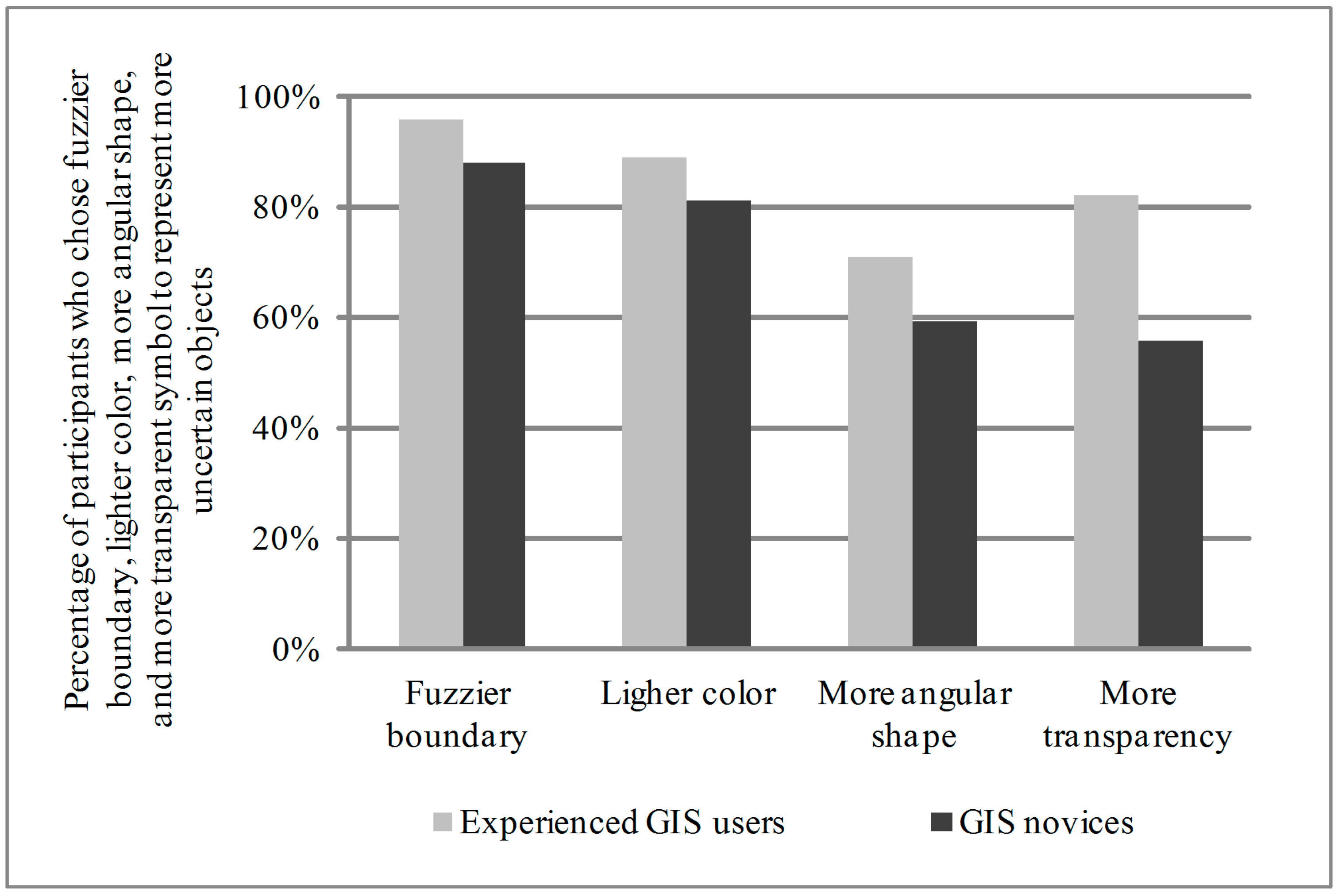
In the visualization task (Part 1), maps 1–4 were provided to the participants. No contextual information about areal precipitation or the associated uncertainty of the precipitation data were shown on the maps. Each map was followed by one question asking which directional change of a visual variable is perceived to be associated with a high level of uncertainty. The four questions were: “Do fuzzier boundary or less fuzzy boundary symbols indicate a high level of uncertainty?”, “Do darker colored or lighter colored symbols indicate a high level of uncertainty?”, “Do more angular or less angular (i.e., more circular) shape symbols represent a high level of uncertainty?”, and “Do more transparent or less transparent symbols represent a high level of uncertainty?”. Finally, after viewing all four maps, the participants were asked to rank the four maps from the most preferred uncertainty visualization to the least preferred.
In the decision-making task (Part 2), the participants were asked to choose a better place between the two candidate places to grow a pseudo type of crop. This type of crop was assumed to require an annual precipitation of between 31 and 40 inches. Both candidate places were predicted to have the same perfect level of precipitation for the crop, but with different prediction uncertainty. Map 1 shows the predicted annual precipitation only. Without showing the prediction uncertainty, place (a) and place (b) were expected to be equally good for growing the crop. Map 2 shows both prediction and uncertainty information and was presented to the participants after they finished working with Map 1. On Map 2, the fuzzier boundary symbol at place (a) indicates that the prediction has a higher level of uncertainty than the prediction at place (b). Therefore, place (b) was supposed to be better than place (a) for growing the crop. The last three questions in Part 2 of the survey were used to examine the participants’ perception towards and capabilities in using uncertainty information in decision making.
With the approval from the Institutional Review Board of the authors’ university, the survey was conducted on campus in late April of 2012. The participants included 72 undergraduate students from two World Geography classes, one Remote Sensing class, and two Advanced GIS classes. These classes were chosen to balance the participants’ GIS background needed for this study. According to the GIS course sequence design and requirements at the authors’ university, a student would have taken one or more GIS courses before being able to enroll in the Remote Sensing or the Advanced GIS courses. The World Geography course falls outside of the GIS-related course sequence and does not have such pre-requisite. Of the 72 students who finished the survey, 28 students would have taken three or more GIS/Cartography/Remote Sensing classes by the end of the spring 2012 semester. They were grouped as Experienced GIS Users. A total of 32 students never had any GIS related classes. They were grouped as GIS Novices. The remaining 12 students would have taken one or two GIS related classes by the end of the spring 2012 semester. Aiming at examining the potential impact of GIS knowledge and training on map users’ preference for visualization of uncertainty information and the impact on their decision making with uncertainty information, these 12 students were excluded from further analyses. For informational purposes, the data from their surveys are reported in Appendix II.

3.3. Analysis Methods

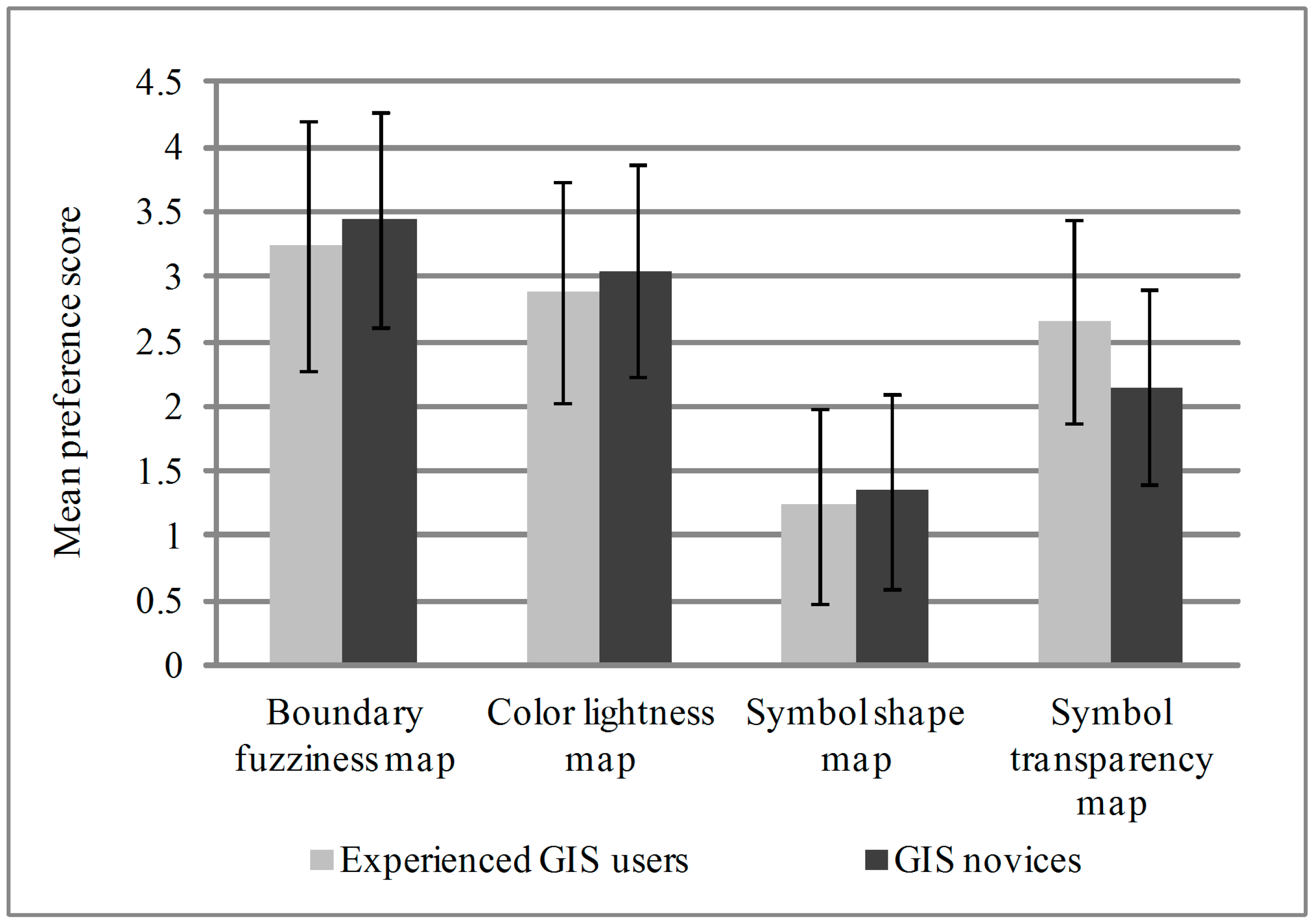
The ranks of the four maps in the responses to Question 5 in Survey Part 1 were coded into preference scores. Among the 60 surveys included in the analyses, 37 participants provided valid rankings. For each valid response, a map ranked first is the most preferred map for reporting uncertainty and receives a preference score of 4; a map ranked the fourth is the least preferred and receives a preference score of 1. Kendall’s coefficient of concordance [24,25,26] was applied to these 37 sets of preference scores to examine the strength of the agreement among the participants regarding preferences for the four bivariate map visualization methods for uncertainty.
For each of the uncertainty maps in Part 1 of the survey, analyses were conducted to investigate the preference difference between the Experienced GIS Users group and the GIS Novices group. The participants’ ranking of preference for the four uncertainty visualization methods were summarized for both groups and are reported in Table 1. Chi-square Test of Homogeneity [26] was used to compare the preferences of the Experienced GIS Users and the GIS Novices. However, the problem of small expected frequency exists for all four maps. This problem was corrected by combining adjacent columns in the contingency table to achieve a greater expected cell frequency [26].
Table 1. Number of preference ranking for the four maps.
Visual VariableParticipant GroupLeast Preferred2nd-Least Preferred2nd-Most PreferredMost Preferred
Boundary fuzziness mapExperienced GIS Users1349
GIS Novices11612
Color lightness mapExperienced GIS Users0755
GIS Novices0677
Symbol shape mapExperienced GIS Users15101
GIS Novices16130
Symbol transparency mapExperienced GIS Users1682
GIS Novices31241

4. Results and Discussion

4.1. Visualization of Uncertainty

Regarding using different visual variables to represent a high level of uncertainty, the majority of the survey participants preferred map symbols with a fuzzier boundary (92%), lighter color (85%), more angular shape (66%), and more transparency (68%) (Figure 1). The result supports Johnson and Sanderson’s statement that fuzzy objects tend to naturally be considered as uncertain [23]. The choice of using lighter color symbols for a high level of uncertainty echoes the finding by Kubicek and Sasinka [16] and MacEachren [17] that lighter colors are perceived as being less prominent. The participants’ choice of more transparent symbols for a high level of uncertainty supports MacEachren and others [22], suggesting that opaque objects are more likely to be considered as more certain ones. Furthermore, it is important to note that the participants tended to concur more on how boundary fuzziness and symbol lightness should be used to represent uncertainty on a bivariate map. Therefore, symbol boundary fuzziness and color lightness are more appropriate variables for uncertainty visualization on bivariate maps as these variables tend to be interpreted in a similar way by most map readers, and they are the most preferred visual variables.
When comparing the Experienced GIS Users with the GIS Novices in how they associate the changing directions of the four visual variables with a high level of uncertainty, the largest gap was found on symbol transparency (Figure 1). A much higher percentage of Experienced GIS Users (82%) than the GIS Novices (56%) chose more transparent symbols for a high level of uncertainty. Consistently, more Experienced GIS Users than GIS Novices in the survey associated the changing of the visual variables with the dynamics of uncertainty levels in the directions that were predicted in literature, e.g., [16,17,22,23]. This suggests the possible impact of GIS training on one’s map reading and uncertainty interpretation skills.
Figure 1. Percentage of participants who prefer different visual variables to represent a high level of uncertainty.
Ijgi 03 01180 g001
Each survey participant was asked to rank the four maps from the most preferred to the least preferred for visualization of uncertainty (Question 5 in Part 1 of the survey). A total of 37 survey participants provided valid responses to this question, among whom 17 were Experienced GIS Users and 20 were GIS Novices (Table 1). The ranks of preference were coded and summarized in Table 1. Kendall’s coefficient of concordance test was conducted on the 37 sets of preference scores; the result revealed a significant agreement (p ≤ 0.005) among the survey participants in terms of their ranking for the four maps. Specifically, boundary fuzziness was the most preferred (with a mean preference score of 3.35), followed by color lightness (score of 2.97), symbol transparency (score of 2.38), and symbol shape (score of 1.3) (Figure 2). It is interesting to note that this order of preference for the four visualization variables is the same as the agreement levels among the survey participants when they were asked how to associate the visual variables with uncertainty levels. This reinstates the finding that boundary fuzziness and color lightness are the most appropriate visual variables to report uncertainty on bivariate maps, as they create the least confusion (Figure 1) and are the most preferred (Figure 2).
When comparing the Experienced GIS Users with the GIS Novices on their preference for the visual variables to report uncertainty, Chi-square tests revealed no significant difference for boundary fuzziness, color lightness, and symbol shape. However, when symbol transparency was investigated, significant difference was identified between these two groups (p < 0.05). The Experienced GIS Users ranked symbol transparency higher than the GIS Novices (Table 1). Recall that there was a relatively low level of agreement (68%) among the survey participants on using more transparent symbols to represent a high level of uncertainty. This confirms that a map that visualizes uncertainty by symbol transparency tends to be difficult for map readers to interpret, especially for the GIS Novices who lack training in map reading. Overall, boundary fuzziness was the most preferred visual variable for representing uncertainty, and the participants showed a strong consensus that fuzzier boundary symbols were better at indicating a high level of uncertainty.
Figure 2. The mean and standard deviation of preference scores of the four visual variables in representing uncertainty.
Ijgi 03 01180 g002

4.2. Uncertainty and Decision Making

Part 2 of the survey was to investigate map users’ ability to use uncertainty information together with geographic data for decision making. When only the predicted precipitation was shown on the map, approximately 82% of the survey participants decided that place (a) and place (b) were equally good for growing the crop. When the prediction uncertainty was provided as well, approximately 70% of the participants chose place (b) as better than place (a) to grow the crop. This result revealed that the majority of the participants were able to successfully incorporate the uncertainty information about precipitation into their location decision process. This confirms the findings by Evans [5] and by Leitner and Buttenfield [6], and suggests that most people could make better decisions with uncertainty information properly reported on a map.
Among the 60 survey responses that were included for this case study, a higher percentage of the Experienced GIS Users than the GIS Novices made the correct decision on where to grow the crop; this remained true regardless of whether uncertainty information was provided or not (Table 2). This may indicate that the Experienced GIS Users understood both general maps and uncertainty maps better, and they were better at making decisions with uncertainty information. However, a Chi-square test did not reveal any significant difference between these two groups of participants in their decision making (Table 2). A short introduction of the uncertainty aspect in precipitation prediction was given at the beginning of the survey. It is possible that this brief discussion may have helped the GIS Novices make better decisions on the survey questions.
Table 2. Observed frequencies of correct and incorrect decisions made with and without the uncertainty information.
DecisionsCorrect DecisionsIncorrect DecisionsPercentage of Correct Decisions
Decision made without uncertainty informationExperienced GIS Users25389%
GIS Novices24875%
Decision made with uncertainty informationExperienced GIS Users21775%
GIS Novices211166%
To understand participants’ acceptance level of uncertainty maps, the survey asked the participants how helpful they felt uncertainty information was for their decision making, and if they were willing to use uncertainty information for their future decision making. Approximately 95% of the participants acknowledged that uncertainty information was helpful in decision making and 92% indicated they would use uncertainty information if provided (Table 3 and Table 4). More people seemed to appreciate uncertainty information and were willing to use it for decision making than people who actually made correct decisions with the uncertainty map (Table 2, Table 3 and Table 4). This may indicate a gap between people’s acceptance level to uncertainty maps and their actual capability in incorporating uncertainty maps in making correct decisions.
Table 3. Observed frequencies on the helpfulness of uncertainty information for decision making.
Does Uncertainty Information Help You Make Better Decisions?Experienced GIS UsersGIS NovicesTotal
Very helpful111122
Somewhat helpful171835
Not at all helpful022
Not sure011
Total283260
Table 4. Observed frequencies on willingness to use uncertainty information in decision making.
Are You Willing to Use Uncertainty Information in Decision Making if It Is Provided?Experienced GIS UsersGIS NovicesTotal
Yes262955
No235
Total283260
Five participants (roughly 8% of total) were reported to be unwilling to use uncertainty for future decision making. Survey data showed that either they did not understand the concept of uncertainty (only one participant) or the uncertainty map was too complicated for them to use (the other four participants). The same problem was identified by Blenkinsop and others [18]. Note that none of the survey participants chose the option “Do not care about uncertainty”. Therefore, with appropriate education on uncertainty and uncertainty maps, the general public could potentially incorporate uncertainty information to make better decisions.

5. Conclusions

This paper investigated map users’ perception and preference for different visual variables on bivariate uncertainty maps, and further examined if GIS knowledge and training had an impact on map users’ ability to understand uncertainty and use uncertainty maps for decision making. Precipitation data from Texas was collected and used to make several precipitation prediction maps with various uncertainty levels. A survey was conducted among the college students at the authors’ university. Data was collected on map users’ preferences for visual variables for reporting uncertainty on bivariate maps and on how well uncertainty information can be used by the participants for decision making. Kendall’s coefficient of concordance and Chi-square test of homogeneity were applied to the survey data. The results showed that boundary fuzziness was the most preferred visual variable for uncertainty representation on bivariate maps followed by color lightness. It was highly agreeable to the participants that fuzzier boundaries and lighter colors were associated with a high level of uncertainty. The Experienced GIS Users had a higher success rate than the GIS Novices in decision making, with or without uncertainty information. It is believed that GIS knowledge and training enhanced the Experienced GIS Users’ capability in decision making using maps. Most participants reported a positive attitude towards using uncertainty information for decision making.
The result of this case study is very positive. Uncertainty information was highly appreciated by most participants, even though it is a complex concept and often hard for some people to use for decision making. It is believed that with a carefully designed training session on geographic data quality and a proper explanation on the map background and its uncertainty aspect, the general public may be able to understand an uncertainty map better and further incorporate the uncertainty information into their decision making.
It should be noted that the conclusions of this study were drawn from a survey using one particular dataset. Although this is a commonly adopted practice in literature, e.g., [5,6,7,14], the properties of any dataset may affect the survey results and thus the findings from a study. Therefore, cautions must be applied when extending the findings from this study to uncertainty visualization and decision making using other datasets. Future studies are needed to investigate how dataset properties may impact users’ preference for uncertainty visualization and their decision making with uncertainty information. Finally, the authors recognize that the choices listed as possible reasons for not willing to use uncertainty information for decision making (last question for Part 2 of the survey) are limited and may appear to be guiding. Note that these choices were included to reflect the findings from existing literature. Being the last question on the entire survey, the possible impact on the survey participants’ responses should be limited.

Acknowledgments

The authors would like to thank Todd Moore for sharing the precipitation dataset for Texas, using which the maps were created. We also thank the instructors of the GIS, Remote Sensing, and World Geography classes for letting us conduct the survey in their classes and the students from these classes for participating in our survey.

Author Contributions

Both authors have contributed equally to the research and writing of this paper.

Conflicts of Interest

The authors declare no conflict of interest.

References

  1. United States Geological Survey (USGS). Spatial Data Transfer Standard (SDTS)—Part 1, Logical Specifications, 1997. In U.S. Geological Survey. Available online: http://thor-f5.er.usgs.gov/sdts/standard/latest_draft/pdf/part1.pdf (accessed on 28 September 2014).
  2. Gahegan, M.; Ehlers, M. A framework for the modeling of uncertainty between remote sensing and geographic information. ISPRS J. Photogramm. Remote Sens. 2000, 55, 176–188. [Google Scholar] [CrossRef]
  3. Zhu, A.X. Research issues on uncertainty in geographic data and GIS-based analysis. In A Research Agenda for Geographic Information Science; McMaster, R.B., Usery, E.L., Eds.; CRC Press LLC.: Boca Raton, FL, US, 2005; pp. 197–224. [Google Scholar]
  4. Usery, E.L.; McMaster, R.B. Introduction to the UCGIS research agenda. In A Research Agenda for Geographic Information Science; McMaster, R.B., Usery, E.L., Eds.; CRC Press LLC.: Boca Raton, FL, US, 2005; pp. 1–15. [Google Scholar]
  5. Evans, B.J. Dynamic display of spatial data-reliability: Does it benefit the map user? Comput. Geosci. 1997, 23, 409–422. [Google Scholar]
  6. Leitner, M.; Buttenfield, B. Guidelines for the display of attribute certainty. Cartogr. Geogr. Inf. Sci. 2000, 27, 3–14. [Google Scholar] [CrossRef]
  7. Schweizer, D.M.; Goodchild, M.F. Data quality and choropleth maps: An experiment with the use of color. In Proceedings of GIS/LIS-International Conference, San Jose, CA, USA, 10–12 November 1992; American Society for Photogrammetry and Remote Sensing: Bethesda, MD, USA, 1992; pp. 686–699. [Google Scholar]
  8. Wittenbrink, C.M.; Pang, A.T.; Lodha, S.K. Glyphs for visualizing uncertainty in vector fields. IEEE Trans. Vis. Comput. Gr. 1996, 2, 266–279. [Google Scholar]
  9. Davis, T.J.; Keller, C.P. Modeling and visualizing multiple spatial uncertainties. Comput. Geosci. 1997, 23, 397–408. [Google Scholar] [CrossRef]
  10. Ehlschlaeger, C.R.; Shortridge, A.M.; Goodchild, M.F. Visualizing spatial data uncertainty using animation. Comput. Geosci. 1997, 23, 387–395. [Google Scholar] [CrossRef]
  11. MacEachren, A.M.; Brewer, C.A.; Pickle, L.W. Visualizing georeferenced data: Representing reliability of health statistics. Environ. Plan. A 1998, 30, 1547–1561. [Google Scholar] [CrossRef]
  12. Bastin, L.; Fisher, P.F.; Wood, J. Visualizing uncertainty in multi-spectral remotely sensed imagery. Comput. Geosci. 2002, 28, 337–350. [Google Scholar]
  13. Aerts, J.; Clarke, K.C.; Keuper, A.D. Testing popular visualization techniques for representing model uncertainty. Cartogr. Geogr. Inf. Sci. 2003, 30, 249–261. [Google Scholar] [CrossRef]
  14. Sanyal, J.; Zhang, S.; Bhattacharya, G.; Amburn, P.; Moorhead, R.J. A user study to compare four uncertainty visualization methods for 1D and 2D datasets. IEEE Trans. Vis. Comput. Gr. 2009, 15, 1209–1218. [Google Scholar]
  15. Burt, J.E.; Zhu, A.X.; Harrower, M. Depicting classification uncertainty using perception-based color models. Ann. GIS 2011, 17, 147–153. [Google Scholar] [CrossRef]
  16. Kubicek, P.; Sasinka, C. Thematic uncertainty visualization usability—Comparison of basic methods. Ann. GIS 2011, 17, 253–263. [Google Scholar]
  17. MacEachren, A.M. Visualizing uncertain information. Cartogr. Perspect. 1992, 13, 10–19. [Google Scholar]
  18. Blenkinsop, S.; Fisher, P.; Bastin, L.; Wood, J. Evaluating the perception of uncertainty in alternative visualization strategies. Cartographica 2000, 37, 1–14. [Google Scholar] [CrossRef]
  19. Viard, T.; Caumon, G.; Lévy, B. Adjacent versus coincident representations of geospatial uncertainty: Which promote better decisions? Comput. Geosci. 2011, 37, 511–520. [Google Scholar] [Green Version]
  20. Bertin, J. Graphics and Graphic Information Processing; Walter de Gruyter: Berlin, Germany, 1981; pp. 186–187. [Google Scholar]
  21. Gershon, N. Visualization of an imperfect world. IEEE Comput. Gr. Appl. 1998, 18, 43–45. [Google Scholar] [CrossRef]
  22. MacEachren, A.M.; Robinson, A.; Hopper, S.; Gardner, S.; Murray, R.; Gahegan, M.; Hetzler, E. Visualizing geospatial information uncertainty: What we know and what we need to know. Cartogr. Geogr. Inf. Sci. 2005, 32, 139–160. [Google Scholar] [CrossRef]
  23. Johnson, C.R.; Sanderson, A.R. A next step: Visualizing errors and uncertainty. IEEE Comput. Gr. Appl. 2003, 23, 6–10. [Google Scholar]
  24. Kendall, M.G.; Smith, B.B. The problem of m rankings. Ann. Math. Stat. 1939, 10, 275–287. [Google Scholar] [CrossRef]
  25. Wallis, W.A. The correlation ratio for ranked data. J. Am. Stat. Assoc. 1939, 34, 533–538. [Google Scholar]
  26. Daniel, W.W. Applied Nonparametric Statistics, 2nd ed.; Duxbury: Pacific Grove, CA, USA, 1990; pp. 192–198. [Google Scholar]

Appendix I

Survey on Visualization of Uncertainty
IRB Exemption Number: XXXX
My name is XXXX. I am a PhD student in the Department of XXXX at XXXX University. I would like to invite you to participate in my research project by taking this 10-minute survey.
The purpose of this survey is to examine how uncertainty can be incorporated into decision making, and how to visualize uncertainty on a map. This survey consists of two parts, eleven questions. No private information will be collected.
If you have any question about this survey or the research project, please email me at XXXX. THANK YOU for your participation!
GIS Experience
Including the current semester, how many GIS/Cartography/Remote Sensing courses have you taken? __________
  • None
  • One
  • Two
  • Three
  • More than three
Background (Please read carefully!)
This survey consists of 6 maps showing the predicted annual precipitation value (in inches) at some weather stations in Texas. The predicted annual precipitation value is calculated from the mean annual precipitation of the past 10 years. Since annual precipitation varies across years, the larger the variation at a place, the more difficult it is to accurately predict the annual precipitation; the prediction for such a place has a higher uncertainty. The degree of uncertainty in the prediction is measured by the variations of annual precipitation from the past 10 years.
PART 1 Visualization of Uncertainty
Map 1
  • The map below uses symbol size to represent predicted annual precipitation value and fuzziness to represent prediction uncertainty. Which way represents uncertainty better? _______
    • The less fuzzy the symbol, the more uncertain in precipitation like weather station (a)
    • The fuzzier the symbol, the more uncertain in precipitation like weather station (b)
Ijgi 03 01180 i001
Map 2
2.
The map below uses symbol size to represent predicted annual precipitation value and brightness of the color to represent prediction uncertainty. Which way represents uncertainty better? _______
  • The darker the symbol, the more uncertain in precipitation like weather station (a)
  • The lighter the symbol, the more uncertain in precipitation like weather station (b)
Ijgi 03 01180 i002
Map 3
3.
The map below uses symbol size to represent predicted annual precipitation value and symbol shape to represent prediction uncertainty. Which way represents uncertainty better? _______
  • The more angular in shape, the more uncertain in precipitation like weather station (a)
  • The more circular in shape, the more uncertain in precipitation like weather station (b)
Ijgi 03 01180 i003
Map 4
4.
The map below uses symbol size to represent predicted annual precipitation value and transparency to represent prediction uncertainty. Which way represents uncertainty better? _______
  • The more transparent, the more uncertain in precipitation like weather station (a)
  • The less transparent, the more uncertain in precipitation like weather station (b)
Ijgi 03 01180 i004
5.
Please rank Map 1 to Map 4 from your most favorite way to least favorite way in presenting uncertainty information: _____________________________________
PART 2 Uncertainty and Decision Making
Map 1
  • The following map shows the predicted annual precipitation value using symbol size. Assume you are growing a certain type of crop requiring annual precipitation between 31 and 40 inches, when everything else is equal, compared to place (b), place (a) is _________
    • more preferred for growing the crop
    • less preferred for growing the crop
    • equally preferred for growing the crop
Ijgi 03 01180 i005
Map 2
The map below uses symbol size to represent predicted annual precipitation value and fuzziness to represent prediction uncertainty. The fuzzier triangles indicate higher degrees of uncertainty.
2.
Assume you are growing a certain type of crop requiring annual precipitation between 31 and 40 inches, compared to place (b), place (a) is _________
  • more preferred for growing the crop
  • less preferred for growing the crop
  • equally preferred for growing the crop
Ijgi 03 01180 i006
Considering the previous two maps, please tell us:
3.
Does uncertainty information help you make better decisions? ________
  • Very helpful
  • Somewhat helpful
  • Not at all helpful
  • Not sure
4.
Are you willing to use uncertainty information in decision making if it is provided? ________
  • Yes
  • No
5.
If your answer is “No” to the above question, why? ________
  • Do not care about Uncertainty
  • Do not understand Uncertainty
  • Too complicated to use information on Uncertainty
  • Other
If “Other”, please explain here:

Appendix II

Table A1. Percentage of participants in neither group who prefer for different visual variables to represent a high level of uncertainty.
Visual Variables for a High Level of UncertaintyFuzzier BoundaryLighter ColorMore Angular ShapeMore Transparency
Percentage of participants in neither group75%92%83%83%
Table A2. Number of preference ranking for the four maps by participants in neither group.
Visual Variable Least Preferred2nd-Least Preferred2nd-Most PreferredMost Preferred
Boundary fuzziness map1134
Color lightness map1503
Symbol shape map6210
Symbol transparency map1152
Table A3. The mean and standard deviation of preference scores of the four visual variables in representing uncertainty by participants in neither group.
Visual VariableBoundary FuzzinessColor LightnessSymbol ShapeSymbol Transparency
Mean preference score3.112.561.442.89
Standard deviation1.0541.1300.7260.928
Table A4. Observed frequencies of correct and incorrect decisions made with and without the uncertainty information by participants in neither group.
DecisionsCorrect DecisionsIncorrect DecisionsPercentage of Correct Decisions
Decision made without uncertainty information7464%
Decision made with uncertainty information8467%
Table A5. Observed frequencies on the helpfulness of uncertainty information for decision making by participants in neither group.
Does Uncertainty Information Help You Make Better Decisions?Very HelpfulSomewhat HelpfulNot at All HelpfulNot SureTotal
Participants in neither group381012
Table A6. Observed frequencies on willingness to use uncertainty information in decision making by participants in neither group.
Are You Willing to Use Uncertainty Information in Decision Making if It Is Provided?YesNoTotal
Participants in neither group11112

