A Change of Theme: The Role of Generalization in Thematic Mapping


1
Faculty ITC, The University of Twente, 7514 AE Enschede, The Netherlands
2
LASTIG, Univ Gustave Eiffel, IGN, ENSG, F-94160 Saint-Mande, France
3
Fachhochschule Nordwestschweiz, 5210 Windisch, Switzerland
*
Author to whom correspondence should be addressed.
ISPRS Int. J. Geo-Inf. 2020, 9(6), 371; https://0-doi-org.brum.beds.ac.uk/10.3390/ijgi9060371
Submission received: 22 February 2020
/
Revised: 25 May 2020
/
Accepted: 29 May 2020
/
Published: 4 June 2020
(This article belongs to the Special Issue Map Generalization)
Abstract
:Cartographic generalization research has focused almost exclusively in recent years on topographic mapping, and has thereby gained an incorrect reputation for having to do only with reference or positional data. The generalization research community needs to broaden its scope to include thematic cartography and geovisualization. Generalization is not new to these areas of cartography, and has in fact always been involved in thematic geographic visualization, despite rarely being acknowledged. We illustrate this involvement with several examples of famous, public-audience thematic maps, noting the generalization procedures involved in drawing each, both across their basemap and thematic layers. We also consider, for each map example we note, which generalization operators were crucial to the formation of the map’s thematic message. The many incremental gains made by the cartographic generalization research community while treating reference data can be brought to bear on thematic cartography in the same way they were used implicitly on the well-known thematic maps we highlight here as examples.
1. Introduction
People outside the discipline and students early in their studies are often surprised to learn that mapmakers willfully filter and modify the information included on any given map in the interest of clarifying the overall message. Omission of things and places on maps is perhaps one of the first things people become aware of when they learn this, giving them a new appreciation of the saying about how some event caused some place to be “put on the map”. They may further learn that roads, coastlines, or borders are actually more complex than the lines drawn for them, and might even be displaced from their actual location to avoid symbol overlaps. These sorts of disparities between reality and maps are often presented in teaching alongside more deliberate or even nefarious techniques for obscuring the truth [1]. However, aside from mistakes or intentional falsehood [2], we know that these disparities with reality are caused by generalization, and that this is entirely necessary for human understanding and the limitations of graphic resolution at map scales, among other reasons. This highlights a truth that seems so obvious to cartographers that we seem to overlook it completely: generalization plays a role in every map.
To illustrate the ubiquity of generalization in thematic cartography, we highlight the operators (i.e., generalization procedures and transformations) involved in compiling and drawing a series of famous, public-audience thematic and navigational maps, using mostly contemporary examples. Specifically, we tag each map for generalization operators used in their creation, using the typology of operators presented by Roth, Brewer, and Stryker [3]. Our tagging is not exhaustive; we are in almost all cases inferring the operators that must have been involved for each map, though indeed other unapparent processes of generalization may have taken place. We use the common conception of a thematic map as composed of a basemap (i.e., contextual geographic information) and one or more overlaid thematic layers. For each map example, we identify which operators were employed in producing either the basemap or thematic layers, and we rank these operators as critical to supporting the map’s thematic message, or incidental.
Our aim here is to reintroduce generalization in thematic cartography to scholarly cartographers so that generalization’s power in general, and recent advances by the map generalization research community in particular, can be consciously brought to bear on the often very large and varied datasets today’s data visualization specialists engage with. Generalization and multiple representations have always been pertinent to thematic mapping, well before our saying so now. Our thesis comes as the map generalization research community is awakening to the importance of the broad world of thematic cartography lying outside of the topographic and reference map realm it has recently been focused on.
2. Classifying Generalization Techniques
The elemental techniques used in generalization of geospatial data or map symbols for geographic entities are termed operators [4], and numerous typologies of these have been defined throughout recent years. Most of these have emphasized geometry: different manipulations and adjustments of spatial data resulting in shapes or groups of pixels that lose undesired or illegible detail, or are arranged together on the map plane such that their essential, if not planimetrically true positional relationships remain illustrated. We use a relatively unique typology here, namely that of Roth, Brewer, and Stryker [3] because, in addition to providing clear definitions of each operator named, this typology approaches the suite of generalization techniques more holistically in that it includes thematic filtering, changes in graphic variables, and variations in textual elements, as well as geometric changes, as parts of the generalization process, all being constrained by map resolution and legibility [5]. While this typology is less exhaustive in defining geometric operators than others (e.g., [6,7,8,9,10,11]), it nonetheless recognizes that generalization and multiple representations are achieved not only by geometric manipulation, but also in close relation to the themes being mapped and the graphic resolution at which the map is being presented. Furthermore, it reflects how generalization and symbol and style design are intertwined cartographic processes. We reproduce the Roth, Brewer, and Stryker coding scheme in Table 1; for each example map that follows, we note which of the operators in the scheme are used to create that map across both thematic and basemap layers, by presenting this in a tabular “schedule” of operators. We identify operators in each schedule as either critical or incidental to the map’s thematic message.
3. Beck’s London Underground
One of the most iconic and celebrated maps in the world, that of the London Underground rail network (or “Tube”, see Figure 1 and Table 2), is heavily generalized. Henry C. Beck, a draughtsman who conceived the map’s diagrammatic design, explicitly sought to improve the informational content of the map and unclutter it; he is quoted by his biographer Ken Garland [12]:
Looking at the old map of the railways, it occurred to me that it might be possible to tidy it up by straightening the lines, experimenting with diagonals and evening out the distances between stations.
This map has been emulated so frequently that most of the metro or subway rail systems of the world, as well as many overland systems, now use a similar schematized geometry with consistent rail line junction angles (typically multiples of 45), rather than represent the planimetrically-accurate rail system in question, even when that rail system is relatively simple. It even inspired a specific field of automated map design, namely map schematization [13], and cartographers have developed automated methods to produce layouts like the Tube Map [14,15]. While the popularity of this map and its style likely has much to do with aesthetics, it also illustrates the power of elucidation that generalization furnishes when done successfully. Transit maps such as Beck’s retain topological relations between stations and lines, which is all a typical subway rider really needs to know when routing themselves from one station to another [16]. Lines that connect the two end points, the points where those lines intersect and allow transfers between trains, and the waypoint stations along the route are more easily read from a map such as this because they mostly lie along easy-to-follow straight lines, rather than the often meandering real routes train tracks often take. Furthermore, since actual speeds over distances or directions moved in are not within the rider’s control, providing these in the form of a planimetric map does not serve the rider in this use case, and qualifies as information that is best reduced or removed (i.e., generalized) in order to lighten overall cognitive load and thereby improve usability. In addition to obvious geometric differences between this map and the rail system it represents, content has been added as a basemap to contextualize the network (i.e., the Thames River), rail lines and station types have been reduced to consistent, typified symbols (e.g., junction stations are all diamond-shaped), and labels have been carefully placed to clarify stations along the heavily-simplified lines.
Elimination (C−) plays a strong role in this map: much that Beck could have included, especially in the basemap about the London context, has been removed in favor of keeping the focus exclusively on the transit routes. Reclassification (Cc) and typification (Sf), also reflected in color-coded labels (La), are used to identify station types (i.e., interchange and not) and the lines to which stations belong; the reader quickly understands that switching from a tick-marked station named in green text to a tick-marked station in black text will involve passing through a diamond-shaped station that the green and black lines share. Most relevant to this map’s notoriety, however, are the generalization operators that modify the rail lines’ shapes to give rise to its schematized [13] character: displacement (Gd), simplification (Gs), and smoothing (Go). These operators are what take the planimetrically-correct rail routes and represent them in heavily abstracted, angular form, for the sake of yielding easily-read straight and sometimes parallel lines and orthogonal junctures. The Thames River in the basemap gets the same treatment so as to be useful as context for the rail lines.
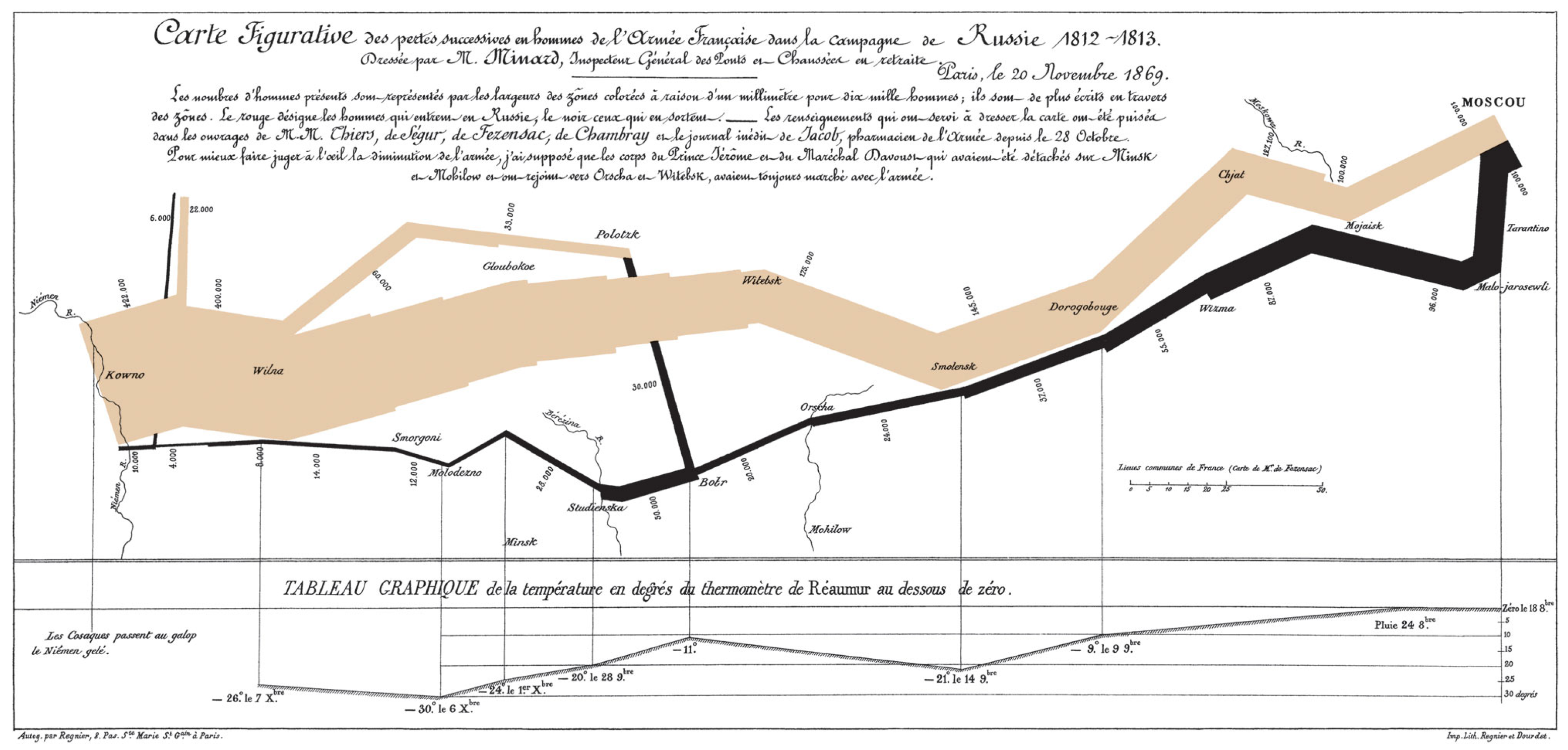
4. Minard’s Map of Napoleon’s March
One of the most celebrated maps among information visualization enthusiasts is Charles Minard’s 1869 map of Napoleon’s 1812 march on Moscow (see Figure 2 and Table 3). A great strength of this map is in its parsimony: it illustrates a series of events over time and space with very little extraneous information, any of which is clearly removed to the background using strongly contrasting beige and black ink for the thematic information presented in the foreground. Symbols are kept to an extreme minimum in this map: contextualizing basemap elements consist of only a few selected and simplified rivers and labeled waypoints. The resulting clarity of the graphics presented, as well as the relatively simple east-then-west movement of the marching army, allow Minard to illustrate time and travel immediately and unambiguously. The greatly simplified trajectory makes canvas space available for wide variation in line thickness, being the graphic variable used to illustrate the main theme of dwindling numbers of soldiers. Heavy generalization in this map provides major support for its rhetorical power. This map has inspired research into automated flow map creation, a challenge which invariably has to use generalization to unclutter masses of trajectories [17,18,19,20,21,22,23,24,25,26,27,28,29,30,31], and this map in particular has inspired in-depth analysis on visualization of time and movement [32].
Similarly to the Tube map, this map’s minimalism—extreme generalization—brings its thematic message to the fore. The relatively bare canvas allows Minard to focus reader attention clearly on the story of army numbers: we see easily how the size of the army began to dwindle almost immediately after it left its initial position, losing numbers to desertion even before arriving at the front. Much detail is eliminated (C−), especially on the nearly non-existent basemap, where only a few notes about river crossings and way-point towns are added (C+), though these are usually done exclusively with text (L+). In addition, like the Tube map, the trajectory of the army’s movement is heavily geometrically simplified (Gs) and displaced (Gd) onto long, straight lines, which help to make very clear Minard’s use of changing line width as a graphic variable for army size. In addition, geometrically important is the use of merging (Gm) to illustrate subsets of the army leaving or rejoining the main group. Especially critical to the thematic message of this map are adjustments in color (Sc), used to denote the army before and after giving up their advance, and size (Sz), dramatically illustrating losses in an easily-perceived manner.
5. Harrison’s the World Divided
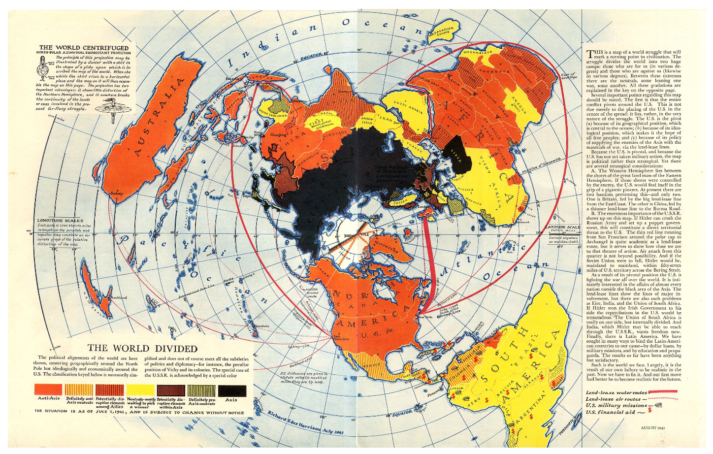
Richard Edes Harrison’s maps for Fortune Magazine during in the mid-20th Century were famous for depicting topographic, demographic, political, and economic data around the world using unusual perspectives and map projections. One such map is The World Divided (see Figure 3, [33], and Table 4), set in a polar azimuthal equidistant projection, explained to the non-specialist audience as “the world centrifuged”. Drawn for a US audience in 1941, during the period when the US had not yet entered WWII, the map had a strongly rhetorical and persuasive aim: to illustrate the geopolitical position of the USA and its allies, distributed around the world, as imperiled by any territorial advances by Axis powers, themselves distributed around the world (Harrison made a similar point a year earlier in [34]). The projection choice is a transformation that helps illustrate Harrison’s point, but generalization in this map is another such transformation: this map succinctly tells a persuasive story because it generalizes away any particular details about the precise nature of relationships with the United States into a simple, ordinal classification of relative alliance. Simple connecting lines indicate nations with which the USA had relations.
The basemap here plays an important role in providing context for the thematic choropleth and connection layers, but its generalization, especially by eliminating (C−), merging (Gm), and simplifying (Gs) islands and landmasses, is incidental, being due to scale and resolution rather than to the definition of Harrison’s message. For thematic information, Harrison’s use of reclassification (Cc) is particularly important, since an important part of the map’s message is to suggest that various territories are held by governments who are more or less allied to The United States in an ordinal ranking. Merging (Gm) and size adjustment (Sz) are present along the lines drawn to illustrate relationships to allied territories; splits and merges serve to group local territories (e.g., present-day Indonesia, then under Dutch colonial rule) along major arterial branches leading to relevant ports in the USA (e.g., Pacific routes meeting at San Francisco), while sea-route line thickness varies according to relative importance. Basemap labels (L+) are particularly important because the map projection presents a world layout unfamiliar to many non-geographer readers.
6. Geography Used by Gapminder
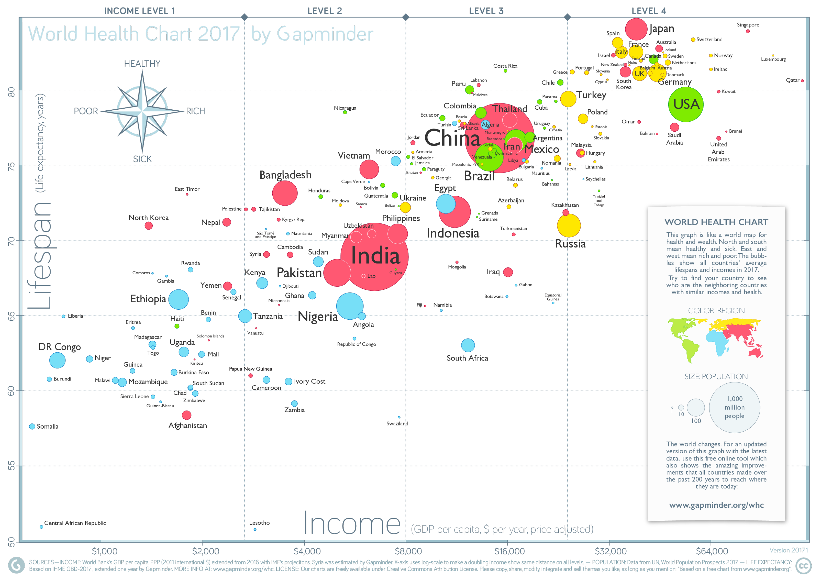
The Gapminder Foundation [35] has in recent years attracted attention for visually compelling illustrations of world health and economic data, partly due to engaging, Internet published talks given by their co-founder, the late Hans Rosling. Particularly famous have been animated versions of Gapminder’s graduated-symbol scatterplots summarizing international levels of life expectancy and income (see Figure 4 and Table 5), where the video steps through time, beginning in the 19th Century and ending with today. The series of “bubble” graphs paints an optimistic general picture, where the trend across all nations is toward longer lives and higher incomes. Differences between countries are highlighted by partitioning them, both into clusters on the scatterplot plane and into continent-wide regions. The graphs are available online, where they are presented in a straightforward geovisualization interface allowing for querying and selection, as well as playback of time-series plots.
The Gapminder site is an outreach effort, and is designed for a non-specialist, public audience. In order to simplify their data presentation, Gapminder compiles its country-level data throughout the 19th, 20th, and 21st Centuries according to today’s national borders. In their own words, “this is absolutely wrong, but it’s necessary to make the animations easier to understand. If our animated bubble charts had displayed all the divisions of territories by splitting bubbles as they animated, the general movement would be much harder to follow, and we would have to manage a much more complex database” [36].
Because Gapminder’s geography is more of a concept than a particular map, it has no basemap. Critical to the national analysis units are reclassification (Cc) into continental units, as well as aggregations (Gg) of statistics from subnational units. Collapse (Gc) and merging (Gm) of areas as they change national identities through historical border changes, as explained in the quote above, are also important for maintaining consistent national units through historical time; had Gapminder not done this, modifiable areal unit problem (MAUP) effects would likely be present in the time-series data and subsequent analyses.
7. Interactive, Multi-Scale “Slippy” Maps
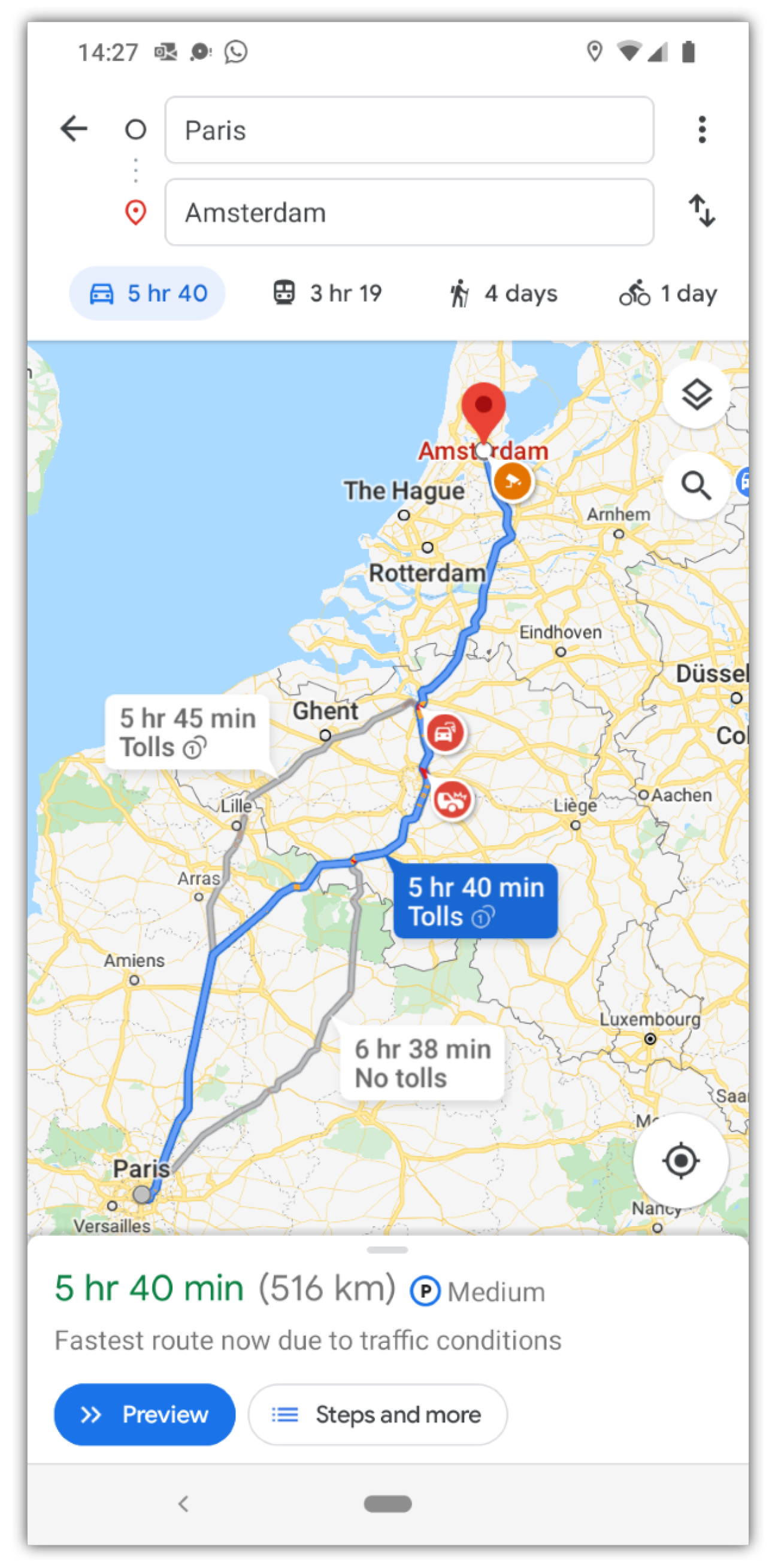
Online maps offering interactive zooming and panning, or “slippy maps” as they are called in the industry, are almost certainly the most popular maps in the world today. A few commercial companies have the most notoriety for these, namely Google (e.g., Figure 5 and Table 6), Bing (Microsoft), Esri, Mapbox, and MapQuest, but popular free and open-source platforms or libraries abound as well, such as OpenStreetMap, Leaflet, and OpenLayers. These are often used both as navigational aides and basemaps for thematic data (see Figure 6). Because these maps allow the user to zoom (i.e., to interactively change map scale), generalization is critical to them, even if only for maintaining legibility. The generalization procedures undertaken by commercial providers are frequently not disclosed, but a few organizations do in fact communicate generalization functionality in their platforms. Mapbox [37], for instance, offers several explicit generalization procedures as options available to developers using their vector mapping platforms, including capabilities to filter features, simplify geometries using the Ramer–Douglas–Peucker algorithm [38,39], or modifying feature attribute values, all dependent on zoom level and consequent screen and map resolution [40]. Even if generalization is not always properly performed, it remains a way to improve these maps [41]. In particular, consistency between thematic data and the basemaps used to contextualize those data is crucial [42]; for example, the roads selected as the shortest routes between Paris and Amsterdam in Figure 5 must be retained and not eliminated in the basemap.
Slippy maps are themselves frequently used as basemaps, providing context for navigational or thematic overlays. Because these basemaps often cover very diverse parts of the Earth, many different operators might be observed across this wide category. Elimination (C−, L−) of map features as one zooms out is probably the single most important operator used in slippy basemaps, accounting for most of their generalization. Attendant to it is the addition (C+) of surrounding detail (e.g., land cover tints added around roads and points of interest) as features toggle on and off based on scale. When thematic information is overlaid on a slippy map, ordering features (Co) is often critical to ensure overlapping symbols do not obscure each other (e.g., a map pin over a route line). Simplification (Gs) is often critical to the legibility of complex shapes, both in the thematic and basemap layers.
The interactivity of these maps makes symbol-based generalization pertinent to their thematic layers. Enhancement (Se) is often seen, for example in drawing intersections between cased road symbols such that their casings don’t cross the junction. Adjustments in color (Sc) are particularly common, with changes in hue often used to indicate feature selections made interactively; sometimes the same is indicated by changing shape (Ss), for example by going from a dot to a pin shape upon user selection. Label additions (L+) often attend such interactive selections.
8. Stamen Watercolor Map
A particular “slippy” interactive map, the Stamen Watercolor Map (available at http://maps.stamen.com/watercolor) is especially known for its artistic style (see Figure 7 and Table 7). Stamen is a design studio focusing on data visualisation; here, they use computer graphics techniques to mimic watercolor painting, characterized by translucent pigments that irregularly build up on paper. This results in fuzzy borders and margins. As a consequence, the watercolor-styled map symbols need more map surface area than more traditional vector symbols, and information density is greatly decreased in comparison to other, more typical topographic maps at the same scale. Only hydrography, roads, and forests are kept in the Stamen Watercolor Map, with roads having gone through a very selective retention process. The map has no point symbols, which would be difficult to render with a watercolor style. The fuzzy edges of colored areas naturally result in smoothed lines.
The watercolor map has cartographic merit [43] in that within some level of accuracy, it is expressive, beautiful, and original; the smooth lines of the watercolor strokes mean that accuracy and precision are lesser and much more inconsistent than in typical maps, but there is undeniable originality and, to many readers, a great deal of beauty to the design. While presenting real-world roads, coastlines, and land cover in an image meant to be emotionally affective, the style is expressive. Part of the appeal of the map may be that it evokes hand-drawn art, having a “sketchy” or human feeling rather than a precise, machine-driven character [44]. Artistic styles such as this one enhance the emotional appeal of a map, which often increases its impact, and finally its use [45]. Cartographers have developed propositions to help map makers reproduce antique cartographic styles [46], or painting styles such as Pop Art [45,46]. Similar to the Watercolor Map, these styles have their own generalization requirements, often calling for even heavier generalization than classical map styles typically do.
The Watercolor map is made available by Stamen through an online API for use as a basemap; while it has its own aesthetic appeal, it typically is not used for its own thematic communication. As with the basemaps seen in the slippy map example, addition of surrounding symbols (C+), this time with color fills to indicate land cover types, plays an important role in these basemaps, while elimination (C−) is probably the single most important operator used, here seen in a very judicious selection of roads and other linear features. Merging (Gm) and smoothing (Go) are particularly important in the watercoloring emulation here; separate but clustered instances of things like islands are naturally merged into larger masses by the blot-like technique, and perimeters and line strokes are inherently smoothed with the blob-like shapes of the watercolor “brushstrokes”. Enhancement (Se), “graphic embellishments around or within a feature to maintain or emphasize feature relationships”, [3] are used throughout, frequently by allowing important features such as selected roads to be symbolized with large brushstrokes. Unlike most basemaps, the Watercolor map has no labels.
9. Beccario’s Earth
As with “slippy” maps, virtual globes need to generalize for viewing resolution on demand, since they offer dynamic zooming and panning and, frequently, changes in perspective or viewing angle. Likely the most famous example of these is Google Earth [47]. Another particularly compelling virtual globe is Cameron Beccario’s earth (see Figure 8, [48], and Table 8), which continuously gathers oceanographic and atmospheric data to render scientific visualizations of these using colors, textures, and animated vector strokes. It allows users to select between views of various environmental parameters, as well as map projections beyond an orthographic one for a globe. Panning in each map projection continuously alters that projection’s aspect (i.e., its central meridian, areas shown and occluded, and its areas of relative distortion). In any projection and at any zoom level, symbols for atmospheric and oceanographic phenomena are recalculated and rendered according to the user’s screen resolution, and thus generalization happens on-the-fly.
This map makes very minimal use of a basemap: there are landmasses and little else, with small islands having been eliminated (C−), and resolution-based incidental simplification (Gs) of coastlines (clearly visible while zooming on the map). Most of the generalization present happens with the many small, animated strokes used to represent the moving thematic oceanic or atmospheric fluids, and with colors used to classify measures these fluids. Aggregations (Gg) of strokes, when they flow into each other in an area too small to show individual strokes, play a crucial role in keeping the moving patterns legible and uncluttered. The strokes form areal patterns that are frequently adjusted (Sp) to maintain relative densities across the map surface. Reclassifications (Cc) and adjustments to color (Sc) are important to illustrate relative magnitudes of themes such as wind speed.
10. Hennig’s UK Election Cartograms
Cartograms are maps where areas are distorted to convey some variable. The technique is usually used for thematic cartography [49]. A striking example of the visual power of cartograms is the 2019 British elections map by Benjamin Hennig (see Figure 9, [50], and Table 9). The non-distorted map suggests an overwhelming win for the Conservative Party (in blue), but a very different story is illustrated when the geographical areas are distorted such that Parlimentary constituencies have equivalent plotted area: in this view, the Conservative electoral win is seen as more moderate in proportion.
In these maps, we consider the borders of the British Isles as the basemap, with the Parlimentary constituencies mapped inside these borders as the thematic information. Generalization, by means of content and geometric transformations, plays a clear role in the clarity of this cartogram. An important goal of most map generalization is to preserve the geography (i.e., shape and form), despite geometric transformations. In this case, the stacked hexagons still recognizably represent the United Kingdom because shapes and topology have been largely preserved. The essence of this map is the preservation of the shape of the British Isles (the basemap) while transforming the thematic information for clarity; both are critical, as shown by the cartogram on the right where geography preservation is much less convincing, making this map less readable than the one with hexagons. This use case is interesting because it illustrates the differences between a map without generalization (left), with good generalization decisions (middle), and with worse generalization decisions (right, without preservation of recognizable shapes).
Cartograms represent a unique map transformation. By their nature, they exemplify exaggeration (Gx) and adjustments of size (Sz) to make their thematic points, across both basemaps and thematic layers. The adjustment of shape (Ss) follows as an incidental consequence of the resizing. Hennig’s two cartograms presented in this example also rely heavily on reclassification (Cc) of electoral constituencies across the UK political parties, aggregating (Gg) votes to that geographical unit. In addition, important to the center map among the three presented is the adjustment of pattern (Sp) into a lattice of hexagons in such a way that it still resembles the un-distorted United Kingdom and preserves some of the topological connections and relative proximity relationships of the electoral units. The lattice in the middle map has a kind of clarity that neither the planimetrically-accurate nor the continuous cartogram have, in that it represents the many electoral constituencies in the UK—being discrete and generally uniform things in the political world, but irregular things in real space—as uniform, patterned, individual hexagons that can be easily seen one-by-one or in collection. Cartograms in general, and their automated generation or generalization specifically, are areas wherein further research would be welcome.
11. Counting Operators and Going beyond Operators
Our map examples vary widely—most are particular maps, while “slippy” maps are a whole category—and have been chosen from subjective, personal experience. Statistical frequency analysis on our operator counts would be contrived because our sample is not random and we cannot be certain that it is a representative sample of the very diverse world of thematic cartography. We have, however, tried to observe different rates of operator use across basemap and thematic layers in each of our maps, and have ranked instances of operator use in terms of whether it was critical to the thematic message, or simply incidental. Our counts are summarized in Table 10, collecting the generalization “schedules” that we have identified throughout the preceding discussion as involved in making each map.
While almost all operators in the typology are observed at least a few times across our sampled maps, we note that content and geometry operators are most frequently and consistently used in ways critical to the map message. Reclassification (Cc), aggregation (Gg), merging (Gm) and simplification (Gs) are observed to be most frequent among our map examples. Elimination (C−) is also frequently observed, though mainly on basemaps. This makes sense, since reducing features on basemaps to a relative minimum, while still keeping the basemap informative enough to provide context for the thematic layer, helps to accentuate the generally more content-rich thematic layers. Reclassification is probably frequent because many thematic maps have ordinal or numerical information to illustrate, while aggregation, merging and simplification are geometric operators often driven by reductions in map scale.
Generalizations of symbolization are applied less consistently across our examples, but it is interesting that they are observed more frequently in the interactive setting of slippy maps. These operators would appear to lend themselves more readily to driving visual feedback for user interaction, such as when map features may change colour or shape to indicate a selection made by the user. There appears to be no real pattern in the instances of labeling generalizations across our maps, except that label additions (L+) in slippy maps frequently attend the symbolization generalizations seen there.
Generalization researchers have developed a wealth of theory that readily applies, beyond the reference cartography on which it was mostly developed, to thematic and navigational mapping. Work done on conceptualizing the transformative process of generalization, such as controlling it by a system of constraints [52,53,54,55], or using machine learning and agent-based modeling to drive it [56,57], are easily ported to automated thematic mapping. Measurements of the content of a map and how this can relate to making multiple representations [58,59,60,61] also apply just as easily to thematic maps. Evaluation techniques developed to consider generalization procedures [62,63,64,65,66] likewise apply, since ’what is a good generalized map?’ easily extends to ’what is a good map?’ For instance, the UK election cartograms show two different thematic maps of the election, and one is clearly a ’good map’ with respect to legibility and clarity of message, while the other is not. The clutter and the poor shape preservation of the second cartogram could easily be measured using the evaluation techniques developed for map generalization. These and other gains made by the cartographic generalization research community while treating reference data can be brought to bear on issues in thematic cartography, including the visualization and sense-making of massive, heterogeneous datasets.
12. Conclusions
We have tried to illustrate an obvious but frequently overlooked point: that generalization is ubiquitous and critical in all cartography, and by corollary that it is an important aspect of the highly popular thematic mapping currently capturing public and otherwise non-cartographer attention. The map generalization and multiple representation research community will be missing a vital opportunity if it remains focused on reference mapping to the near exclusion of thematic visualization, as it has in recent years. These examples show that map generalization in thematic maps is not limited to the basemap, but also critically applies to the thematic information displayed on the map. Thus, this is not a simple change of use case that is required (i.e., generalizing the basemaps of thematic pieces), but a more general orientation of automated map generalization principles to the way thematic information is displayed in thematic maps. The field has much to offer in terms of theory and practice, and itself stands to benefit from applying and testing its achievements on a wealth of new, thematic data streams and types.
Author Contributions
All aspects of the work were shared by all authors. All authors have read and agreed to the published version of the manuscript.
Funding
This research received no external funding.
Acknowledgments
The authors would like to thank the anonymous reviewers, whose feedback improved this manuscript.
Conflicts of Interest
The authors declare no conflict of interest.
References
- Monmonier, M. How to Lie with Maps, 3rd ed.; University of Chicago Press: Chicago, IL, USA; London, UK, 2018. [Google Scholar]
- Harley, J.B. Silences and secrecy: The hidden agenda of cartography in early modern Europe. Imago Mundi 1988, 40, 57–76. [Google Scholar] [CrossRef]
- Roth, R.E.; Brewer, C.A.; Stryker, M.S. A typology of operators for maintaining legible map designs at multiple scales. Cartogr. Perspect. 2011, 68, 29–64. [Google Scholar] [CrossRef] [Green Version]
- Stanislawski, L.V.; Buttenfield, B.P.; Bereuter, P.; Savino, S.; Brewer, C.A. Generalisation Operators. In Abstracting Geographic Information in a Data Rich World; Burghardt, D., Duchêne, C., Mackaness, W., Eds.; Lecture Notes in Geoinformation and Cartography; Springer International Publishing: Cham, Switzerland, 2014; pp. 157–195. [Google Scholar] [CrossRef]
- Raposo, P. Scale and Generalization. In The Geographic Information Science & Technology Body of Knowledge, 4th Quarter 2017 ed.; Wilson, J.P., Ed.; University Consortium for Geographic Information Science: Washington, DC, USA, 2017. [Google Scholar]
- McMaster, R.; Shea, K.S. Generalization in Digital Cartography; Resource Publications in Geography, Association of American Geographers: Washington, DC, USA, 1992. [Google Scholar]
- Yaolin, L.; Molenaar, M.; Tinghua, A. Frameworks for Generalization Constraints and Operations Based on Object-Oriented Data Structure in Database Generalization. Geo Spat. Inf. Sci. 2001, 3, 42–49. [Google Scholar] [CrossRef] [Green Version]
- Cecconi, A. Integration of Cartographic Generalization and Multi-Scale Databases for Enhanced Web Mapping. Ph.D. Thesis, University of Zurich, Zürich, Switzerland, 2003. [Google Scholar]
- Regnauld, N.; McMaster, R.C. A synoptic View of Generalisation Operators. In Generalisation of Geographic Information; Mackaness, W.A., Ruas, A., Sarjakoski, L.T., Eds.; Elsevier: Amsterdam, The Netherlands, 2007; pp. 37–66. [Google Scholar] [CrossRef]
- Li, Z. Algorithmic Foundation of Multi-Scale Spatial Representation; CRC Press: Boca Raton, FL, USA; London, UK; New York, NY, USA, 2007. [Google Scholar]
- Foerster, T.; Stoter, J.; Köbben, B. Towards a formal classification of Generalization operators. In Proceedings of the 23rd International Cartographic Conference, Moscow, Russia, 4–10 August 2007; International Cartographic Association: Moscow, Russia, 2007. [Google Scholar]
- Garland, K. Mr. Beck’s Underground Map; Capital Transport Publishing: Berkshire, UK, 1994. [Google Scholar]
- Mackaness, W.; Reimer, A. Generalisation in the Context of Schematised Maps. In Abstracting Geographic Information in a Data Rich World; Burghardt, D., Duchêne, C., Mackaness, W., Eds.; Lecture Notes in Geoinformation and Cartography; Springer International Publishing: Cham, Switzerland, 2014; pp. 299–328. [Google Scholar]
- Nöllenburg, M.; Wolff, A. Drawing and Labeling High-Quality Metro Maps by Mixed-Integer Programming. IEEE Trans. Vis. Comput. Graph. 2011, 17, 626–641. [Google Scholar] [CrossRef] [PubMed] [Green Version]
- van Dijk, T.C.; van Goethem, A.; Haunert, J.H.; Meulemans, W.; Speckmann, B. An Automated Method for Circular-Arc Metro Maps. In International Conference on Geographic Information Science; Springer: Cham, Switzerland, 2014. [Google Scholar]
- Godfrey, L.; Mackaness, W. The bounds of distortion: Truth, meaning and efficacy in digital geographic representation. Int. J. Cartogr. 2017, 3, 31–44. [Google Scholar] [CrossRef] [Green Version]
- Jenny, B.; Stephen, D.M.; Muehlenhaus, I.; Marston, B.E.; Sharma, R.; Zhang, E.; Jenny, H. Design principles for origin-destination flow maps. Cartogr. Geogr. Inf. Sci. 2018, 45, 62–75. [Google Scholar] [CrossRef]
- Phan, D.; Xiao, L.; Yeh, R.; Hanrahan, P. Flow map layout. In Proceedings of the IEEE Symposium on Information Visualization (INFOVIS 2005), Minneapolis, MN, USA, 23–25 October 2005. [Google Scholar]
- Cornel, D.; Konev, A.; Sadransky, B.; Horváth, Z.; Brambilla, A.; Viola, I.; Waser, J. Composite Flow Maps. Comput. Graph. Forum 2016, 35, 461–470. [Google Scholar] [CrossRef]
- Raposo, P. Open-Source Flow Maps with Cubic Splines. In Proceedings of the North American Cartographic Information Society (NACIS) Annual Meeting, Montreal, QC, Canada, 10–13 October 2017. [Google Scholar]
- Yang, Y.; Dwyer, T.; Goodwin, S.; Marriott, K. Many-to-Many Geographically-Embedded Flow Visualisation: An Evaluation. IEEE Trans. Vis. Comput. Graph. 2017, 23, 411–420. [Google Scholar] [CrossRef] [Green Version]
- Andrienko, G.; Andrienko, N.; Fuchs, G.; Wood, J. Revealing Patterns and Trends of Mass Mobility Through Spatial and Temporal Abstraction of Origin-Destination Movement Data. IEEE Trans. Vis. Comput. Graph. 2017, 23, 2120–2136. [Google Scholar] [CrossRef] [Green Version]
- Jenny, B.; Stephen, D.M.; Muehlenhaus, I.; Marston, B.E.; Sharma, R.; Zhang, E.; Jenny, H. Force-directed layout of origin-destination flow maps. Int. J. Geograph. Inf. Sci. 2017, 31, 1521–1540. [Google Scholar] [CrossRef]
- Guo, D. Flow Mapping and Multivariate Visualization of Large Spatial Interaction Data. IEEE Trans. Vis. Comput. Graph. 2009, 15, 1041–1048. [Google Scholar]
- Graser, A.; Schmidt, J.; Roth, F.; Brändle, N. Untangling origin-destination flows in geographic information systems. Inf. Vis. 2017, 18, 153–172. [Google Scholar] [CrossRef]
- Boyandin, I.; Bertini, E.; Bak, P.; Lalanne, D. Flowstrates: An Approach for Visual Exploration of Temporal Origin-Destination Data. Comput. Graph. Forum 2011, 30, 971–980. [Google Scholar] [CrossRef] [Green Version]
- Buchin, K.; Speckmann, B.; Verbeek, K. Flow Map Layout via Spiral Trees. IEEE Trans. Vis. Comput. Graph. 2011, 17, 2536–2544. [Google Scholar] [CrossRef] [Green Version]
- Guo, D.; Zhu, X. Origin-Destination Flow Data Smoothing and Mapping. IEEE Trans. Vis. Comput. Graph. 2014, 20, 2043–2052. [Google Scholar] [CrossRef] [PubMed]
- Wood, J.; Dykes, J.; Slingsby, A. Visualisation of Origins, Destinations and Flows with OD Maps. Cartograph. J. 2010, 47, 117–129. [Google Scholar] [CrossRef] [Green Version]
- Yang, Y.; Dwyer, T.; Jenny, B.; Marriott, K.; Cordeil, M.; Chen, H. Origin-Destination Flow Maps in Immersive Environments. IEEE Trans. Vis. Comput. Graph. 2019, 25, 693–703. [Google Scholar] [CrossRef] [PubMed] [Green Version]
- Zhou, H.; Xu, P.; Yuan, X.; Qu, H. Edge bundling in information visualization. Tsinghua Sci. Technol. 2013, 18, 145–156. [Google Scholar] [CrossRef]
- Kraak, M.J. Mapping Time: Illustrated by Minard’s Map of Napoleon’s Russian Campaign of 1812, 1st ed.; Esri Press: Redlands, CA, USA, 2014. [Google Scholar]
- Harrison, R.E. The World Divided. Fortune Magazine, August 1941; 48–49. [Google Scholar]
- Harrison, R.E. The Joint Problem. Fortune Magazine, December 1940. [Google Scholar]
- Gapminder Foundation. Gapminder. Available online: https://www.gapminder.org/ (accessed on 18 February 2020).
- Gapminder Foundation. Changing Country Borders. Available online: https://www.gapminder.org/data/geo/changes/ (accessed on 16 February 2020).
- Mapbox, Inc. Mapbox. Available online: https://www.mapbox.com/ (accessed on 18 February 2020).
- Ramer, U. An Iterative Procedure for the Polygonal Approximation of Plane Curves. Comput. Graph. Image Process. 1972, 1, 244–256. [Google Scholar] [CrossRef]
- Douglas, D.H.; Peucker, T.K. Algorithms for the Reduction of the Number of Points Required to Represent a Digitized Line or its Caricature. Cartograph. Int. J. Geograph. Inf. Geovis. 1973, 10, 112–122. [Google Scholar] [CrossRef] [Green Version]
- Mapbox, Inc. Tilesets API Recipe Reference. Available online: https://docs.mapbox.com/help/troubleshooting/tileset-recipe-reference/ (accessed on 16 February 2020).
- Dumont, M.; Touya, G.; Duchêne, C. Designing multi-scale maps: Lessons learned from existing practices. Int. J. Cartogr. 2020, 6, 121–151. [Google Scholar] [CrossRef]
- Duchêne, C. Making a map from “thematically multi-sourced data”: The potential of making inter-layers spatial relations explicit. In Proceedings of the 17th ICA Workshop on Generalisation and Multiple Representation, Vienna, Austria, 23 September 2014; ICA: Vienna, Austria, 2014. [Google Scholar]
- Reimer, A. Cartographic Modelling for Automated Map Generation. Ph.D. Thesis, Department of Mathematics and Computer Science, Eindhoven University of Technology, Eindhoven, The Netherlands, 2015. [Google Scholar]
- Wood, J.; Isenberg, P.; Isenberg, T.; Dykes, J.; Boukhelifa, N.; Slingsby, A. Sketchy Rendering for Information Visualization. IEEE Trans. Vis. Comput. Graph. 2012, 18, 2749–2758. [Google Scholar] [CrossRef] [PubMed] [Green Version]
- Christophe, S.; Hoarau, C. Expressive Map Design Based on Pop Art: Revisit of Semiology of Graphics? Cartogr. Perspect. 2013, 73, 61–74. [Google Scholar] [CrossRef] [Green Version]
- Christophe, S.; Dumenieu, B.; Turbet, J.; Hoarau, C.; Mellado, N.; Ory, J.; Loi, H.; Masse, A.; Arbelot, B.; Vergne, R.; et al. Map Style Formalization: Rendering Techniques Extension for Cartography. In Expressive 2016 the Joint Symposium on Computational Aesthetics and Sketch-Based Interfaces and Modeling and Non-Photorealistic Animation and Rendering; Mould, D., Bénard, P., Eds.; The Eurographics Association: Airville, Switzerland, 2016. [Google Scholar]
- Google, Inc. Google Earth. Available online: https://www.google.com/earth/ (accessed on 2 February 2020).
- Beccario, C. Earth. Available online: https://earth.nullschool.net (accessed on 2 February 2020).
- Tobler, W. Thirty Five Years of Computer Cartograms. Ann. Assoc. Am. Geogr. 2004, 94, 58–73. [Google Scholar] [CrossRef]
- Hennig, B. Mapping the 2019 UK General Election. 2019. Available online: http://www.viewsoftheworld.net/?p=5755 (accessed on 6 February 2020).
- Office for National Statistics. Electoral Statistics, UK. 2017. Available online: https://www.ons.gov.uk/peoplepopulationandcommunity/elections/electoralregistration/bulletins/electoralstatisticsforuk/2017 (accessed on 15 April 2020).
- Beard, K.M. Constraints on rule formation. In Map Generalization; Buttenfield, B., McMaster, R., Eds.; Longman Pages: London, UK, 1991; pp. 121–135. [Google Scholar]
- Stoter, J.; van Smaalen, J.; Bakker, N.; Hardy, P. Specifying Map Requirements for Automated Generalization of Topographic Data. Cartograph. J. 2009, 46, 214–227. [Google Scholar] [CrossRef]
- Balley, S.; Baella, B.; Christophe, S.; Pla, M.; Regnauld, N.; Stoter, J. Map Specifications and User Requirements. In Abstracting Geographic Information in a Data Rich World; Burghardt, D., Duchêne, C., Mackaness, W., Eds.; Lecture Notes in Geoinformation and Cartography; Springer International Publishing: Cham, Switzerland, 2014; pp. 17–52. [Google Scholar]
- Harrie, L.; Weibel, R. Modelling the Overall Process of Generalisation. In Generalisation of Geographic Information: Cartographic Modelling and Applications; Mackaness, W.A., Ruas, A., Sarjakoski, L.T., Eds.; Elsevier: Amsterdam, The Netherlands, 2007; pp. 67–87. [Google Scholar]
- Duchêne, C.; Ruas, A.; Cambier, C. The CartACom Model: Transforming Cartographic Features Into Communicating Agents for Cartographic Generalization. Int. J. Geograph. Inf. Sci. 2012, 26, 1533–1562. [Google Scholar] [CrossRef]
- Ruas, A. Les problématiques de l’automatisation de la généralisation. In Généralisation et Représentation Multiple; Ruas, A., Ed.; Traité IGAT Série Géomatique; Hermes Science Publications: Paris, France, 2002; pp. 75–90. [Google Scholar]
- Bjorke, J.T. Information Theory; The Implications for Automated Map Design. In Proceedings of the Europe in Transition Conference, Brno, Czech Republic, 13 February 1994; pp. 8–19. [Google Scholar]
- Bjorke, J.T. Exploration of Information: Theoretic Arguments for the Limited Amount of Information in a Map. Cartogr. Geogr. Inf. Sci. 2012, 39, 88–97. [Google Scholar] [CrossRef]
- Raposo, P. Variable DEM Generalization Using Local Entropy for Terrain Representation Through Scale. Int. J. Cartogr. 2020, 6, 99–120. [Google Scholar] [CrossRef]
- Knöpfli, R. Communication Theory and Generalization. In Graphic Communication and Design in Contemporary Cartography; Taylor, D.R.F., Ed.; Progress in Contemporary Cartography; John Wiley & Sons: New York, NY, USA, 1983; pp. 177–218. [Google Scholar]
- João, E.M. Causes and Consequences of Map Generalisation; Taylor & Francis: London, UK, 1998. [Google Scholar]
- Bard, S.; Ruas, A. Why and How Evaluating Generalised Data? In Developments in Spatial Data Handling; Springer: Berlin/Heidelberg, Germany, 2005; pp. 327–342. [Google Scholar]
- Touya, G. Social Welfare to Assess the Global Legibility of a Generalized Map. In Proceedings of the International Conference on Geographic Information Science, Columbus, OH, USA, 18–21 September 2012; Xiao, N., Kwan, M.P., Goodchild, M.F., Shekhar, S., Eds.; Springer: Berlin/Heidelberg, Germany, 2012; Volume 7478, pp. 198–211. [Google Scholar]
- Stoter, J.; Zhang, X.; Stigmar, H.; Harrie, L. Evaluation in Generalisation. In Abstracting Geographic Information in a Data Rich World; Burghardt, D., Duchêne, C., Mackaness, W., Eds.; Lecture Notes in Geoinformation and Cartography; Springer International Publishing: Cham, Switzerland, 2014; pp. 259–297. [Google Scholar]
- Touya, G.; Hoarau, C.; Christophe, S. Clutter and Map Legibility in Automated Cartography: A Research Agenda. Cartograph. Int. J. Geograph. Inf. Geovis. 2016, 51, 198–207. [Google Scholar] [CrossRef] [Green Version]
Figure 1.
H. C. Beck’s London subway “Tube” map design, as originally published in 1933. This design differed significantly from previous designs in that it introduced a schematized (i.e., heavily generalized) geometry, rather than present the Tube rail lines with planimetric accuracy.
Figure 1.
H. C. Beck’s London subway “Tube” map design, as originally published in 1933. This design differed significantly from previous designs in that it introduced a schematized (i.e., heavily generalized) geometry, rather than present the Tube rail lines with planimetric accuracy.

Figure 2.
Charles Minard’s 1869 map of Napoleon’s march on Moscow in 1812, a thematic flow map depicting the heavy human losses Napoleon’s army suffered using an ever-thinning line. The beige and black areas represent the size of Napoleon’s army through time, with the graphic variable of size (i.e., line width) reflecting counts of soldiers; the beige line progresses eastward for the advancement of the army, the black line regresses westward for its retreat.

Figure 3.
Richard Edes Harrison’s 1941 map about the geopolitical situation of the USA at the outset of WWII. Colors and hatching are used to classify nations according to the cartographer’s idea of how well they align to US policy, while solid or dashed lines represent economic relationships to other countries. The goal of the map is to suggest that the economic relationship “routes” are threatened if regions they pass through become occupied by powers who oppose US policy, such as by the Axis.

Figure 4.
Gapminder’s 2017 global summary scatterplot of life expectancy and income. Colors correspond to continental world regions, and circle size to national population. Online, animated versions of the same visualization step through time, so that “bubbles” are seen to migrate toward higher incomes and lifespans, in general, throughout the last several decades.

Figure 5.
A screen capture from a smartphone of the Google Maps Android app, showing possible driving routes between Paris and Amsterdam, taken 14 February 2020. Routes shown in an overview such as this one are necessarily simplified from their full-resolution, turn-by-turn data.
Figure 5.
A screen capture from a smartphone of the Google Maps Android app, showing possible driving routes between Paris and Amsterdam, taken 14 February 2020. Routes shown in an overview such as this one are necessarily simplified from their full-resolution, turn-by-turn data.

Figure 6.
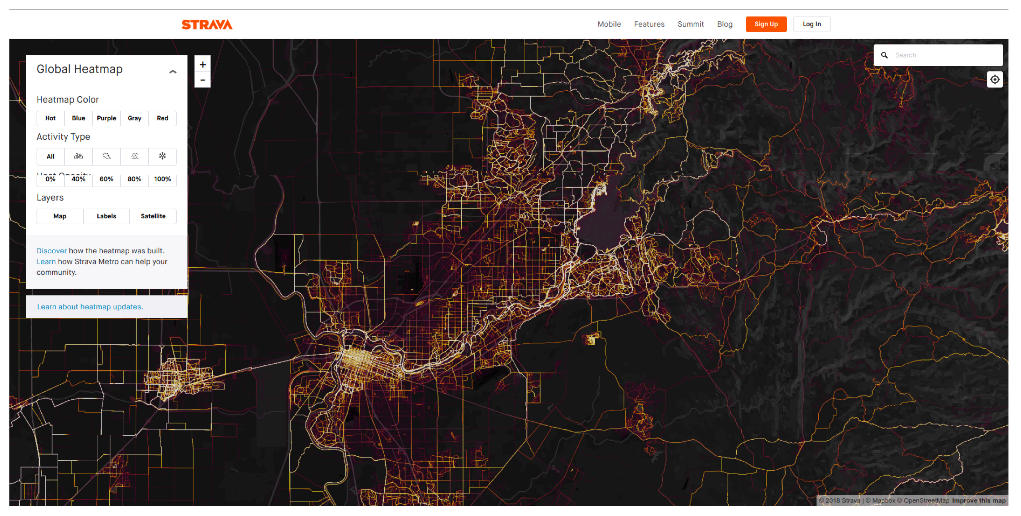
A screen capture, taken 20 March 2020, of the worldwide heatmap (available at https://www.strava.com/heatmap) of user data compiled by Strava, Inc. (San Francisco, CA, USA), a company offering geographic tracking for athletics such as cycling. The map can be zoomed and panned, and the aggregated athlete traces presented to the viewer vary by zoom level.
Figure 6.
A screen capture, taken 20 March 2020, of the worldwide heatmap (available at https://www.strava.com/heatmap) of user data compiled by Strava, Inc. (San Francisco, CA, USA), a company offering geographic tracking for athletics such as cycling. The map can be zoomed and panned, and the aggregated athlete traces presented to the viewer vary by zoom level.

Figure 7.
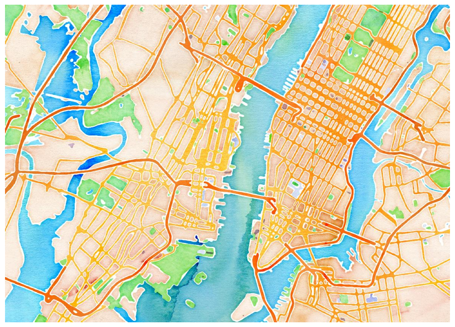
A screen capture, taken 20 March 2020, of the worldwide Stamen Watercolor Map (available at http://maps.stamen.com/watercolor) based on OpenStreetMap data (style: ©Stamen; data: ©OpenStreetMap contributors). The map is the product of heavy abstraction of vector map data using creative applications of image processing techniques and controlled arbitrary and stochastic processes.
Figure 7.
A screen capture, taken 20 March 2020, of the worldwide Stamen Watercolor Map (available at http://maps.stamen.com/watercolor) based on OpenStreetMap data (style: ©Stamen; data: ©OpenStreetMap contributors). The map is the product of heavy abstraction of vector map data using creative applications of image processing techniques and controlled arbitrary and stochastic processes.

Figure 8.
A screen capture, taken 20 March 2020, of earth, an animated virtual globe by Cameron Beccario (available at https://earth.nullschool.net/). Interaction reveals a menu wherein users can select for various atmospheric and oceanographic data themes. The map uses thousands of little animated strokes in flock-like motion to illustrate dynamic Earth processes, such as wind patterns.

Figure 9.
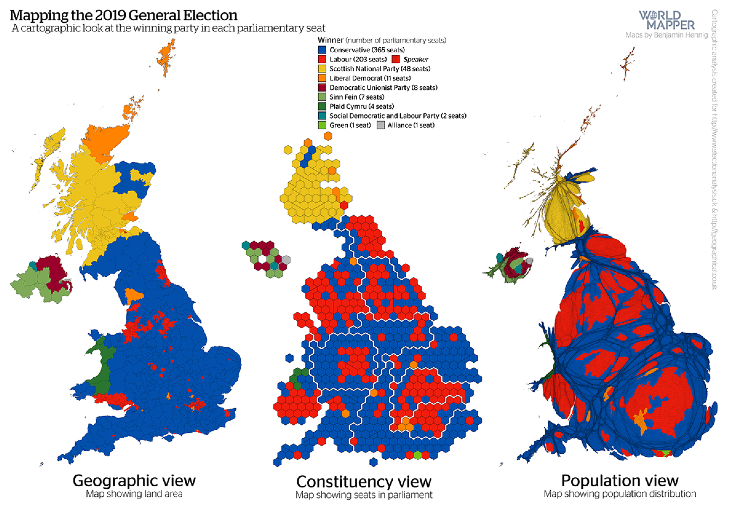
Benjamin Hennig’s cartograms of the United Kingdom’s 2019 General Election (available at http://www.viewsoftheworld.net/?p=5755). A gridded and a non gridded continuous cartogram are presented, along with a planimetric map, allowing for a comparison of cartogram techniques over the same data. The author bases hexagonal grid cells on electoral constituencies in the UK, but also presents a continuous cartogram distorted by population [51].
Figure 9.
Benjamin Hennig’s cartograms of the United Kingdom’s 2019 General Election (available at http://www.viewsoftheworld.net/?p=5755). A gridded and a non gridded continuous cartogram are presented, along with a planimetric map, allowing for a comparison of cartogram techniques over the same data. The author bases hexagonal grid cells on electoral constituencies in the UK, but also presents a continuous cartogram distorted by population [51].


Table 1.
The typology of generalization operators, with abbreviated codes, defined by Roth, Brewer, and Stryker [3].
Table 1.
The typology of generalization operators, with abbreviated codes, defined by Roth, Brewer, and Stryker [3].
| High-Level Category | Operator | Code |
|---|---|---|
| Content | Add | C+ |
| Eliminate | C− | |
| Reclassify | Cc | |
| Reorder | Co | |
| Geometry | Aggregate | Gg |
| Collapse | Gc | |
| Merge | Gm | |
| Displace | Gd | |
| Exaggerate | Gx | |
| Simplify | Gs | |
| Smooth | Go | |
| Symbol | Adjust Color | Sc |
| Enhance | Se | |
| Adjust Iconicity | Si | |
| Adjust Pattern | Sp | |
| Rotate | Sr | |
| Adjust Shape | Ss | |
| Adjust Size | Sz | |
| Adjust Transparency | St | |
| Typify | Sf | |
| Label | Add Label | L+ |
| Eliminate Label | L− | |
| Adjust Appearance | La | |
| Adjust Position | Lp |
Table 2.
Schedule of operators for Beck’s London Underground map.
| Critical | Incidental | |
|---|---|---|
| Thematic | C− Cc Gd Gs Go Sf La Lp | Gc Sr Ss Sz |
| Basemap | C− Gd Gs | Gc Go |
Table 3.
Schedule of operators for Minard’s map of Napoleon’s March.
| Critical | Incidental | |
|---|---|---|
| Thematic | C− Gm Gd Gs Sc Sz | |
| Basemap | C− L+ | C+ Gd |
Table 4.
Schedule of operators for Harrison’s The World Divided.
| Critical | Incidental | |
|---|---|---|
| Thematic | Cc Gm Sz | Go Ss Sf |
| Basemap | L+ | C− Gm Gs |
Table 5.
Schedule of operators for Gapminder geography.
| Critical | Incidental | |
|---|---|---|
| Thematic | Cc Gg Gc Gm | C+ C− |
| Basemap | not applicable | |
Table 6.
Schedule of operators for “slippy” maps.
| Critical | Incidental | |
|---|---|---|
| Thematic | Co Gs Sc Se Ss L+ | |
| Basemap | C+ C− Gs L− | Gg Gc Sc Sf |
Table 7.
Schedule of operators for Stamen Watercolor Map.
| Critical | Incidental | |
|---|---|---|
| Thematic | not applicable | |
| Basemap | C+ C− Gm Go Se | Gc Gx Gs Sc Ss Sz St |
Table 8.
Schedule of operators for Beccario’s earth.
| Critical | Incidental | |
|---|---|---|
| Thematic | Cc Gg Sc Sp | |
| Basemap | C− | Cc Gs Go La |
Table 9.
Schedule of operators for Hennig’s UK Election Cartograms.
| Critical | Incidental | |
|---|---|---|
| Thematic | Cc Gg Gx Sp Sz | Go Ss |
| Basemap | Gx Sp Sz | Gs Go Ss |
Table 10.
A summary of operators used among thematic (Th) and basemap (Bm) layers in all map examples presented, classified as either critical to the definition of the thematic message of the map (c), or incidental to it (i). Tallies of critical uses across these examples are also given.
Table 10.
A summary of operators used among thematic (Th) and basemap (Bm) layers in all map examples presented, classified as either critical to the definition of the thematic message of the map (c), or incidental to it (i). Tallies of critical uses across these examples are also given.
| Beck’s Tube | Minard’s March | Harrison’s World Divided | Gapminder Geography | Slippy Maps | Stamen Watercolor | Beccario’s Earth | Hennig’s Election Cartograms | Counts of Critical Uses | |||||||||||
|---|---|---|---|---|---|---|---|---|---|---|---|---|---|---|---|---|---|---|---|
| Th | Bm | Th | Bm | Th | Bm | Th | Bm | Th | Bm | Th | Bm | Th | Bm | Th | Bm | Th | Bm | ||
| Add | C+ | i | i | c | c | 2 | |||||||||||||
| Eliminate | C− | c | c | c | c | i | i | c | c | c | 2 | 5 | |||||||
| Reclassify | Cc | c | c | c | c | i | c | 5 | |||||||||||
| Reorder | Co | c | 1 | ||||||||||||||||
| Aggregate | Gg | c | i | c | c | 3 | |||||||||||||
| Collapse | Gc | i | i | c | i | i | 1 | ||||||||||||
| Merge | Gm | c | c | i | c | c | 3 | 1 | |||||||||||
| Displace | Gd | c | c | c | i | 2 | 1 | ||||||||||||
| Exaggerate | Gx | i | c | c | 1 | 1 | |||||||||||||
| Simplify | Gs | c | c | c | i | c | c | i | i | i | 3 | 2 | |||||||
| Smooth | Go | c | i | i | c | i | i | i | 1 | 1 | |||||||||
| Adjust Colour | Sc | c | c | i | i | c | 3 | ||||||||||||
| Enhance | Se | c | c | 1 | 1 | ||||||||||||||
| Adjust Iconicity | Si | ||||||||||||||||||
| Adjust Pattern | Sp | c | c | c | 2 | 1 | |||||||||||||
| Rotate | Sr | i | |||||||||||||||||
| Adjust Shape | Ss | i | i | c | i | i | i | 1 | |||||||||||
| Adjust Size | Sz | i | c | c | i | c | c | 3 | 1 | ||||||||||
| Adjust Transparency | St | i | |||||||||||||||||
| Typify | Sf | c | i | i | 1 | ||||||||||||||
| Add Label | L+ | c | c | c | 1 | 2 | |||||||||||||
| Eliminate Label | L− | c | 1 | ||||||||||||||||
| Adjust Appearance | La | c | i | 1 | |||||||||||||||
| Adjust Position | Lp | c | 1 | ||||||||||||||||
© 2020 by the authors. Licensee MDPI, Basel, Switzerland. This article is an open access article distributed under the terms and conditions of the Creative Commons Attribution (CC BY) license (http://creativecommons.org/licenses/by/4.0/).
Share and Cite
MDPI and ACS Style
Raposo, P.; Touya, G.; Bereuter, P. A Change of Theme: The Role of Generalization in Thematic Mapping. ISPRS Int. J. Geo-Inf. 2020, 9, 371. https://0-doi-org.brum.beds.ac.uk/10.3390/ijgi9060371
AMA Style
Raposo P, Touya G, Bereuter P. A Change of Theme: The Role of Generalization in Thematic Mapping. ISPRS International Journal of Geo-Information. 2020; 9(6):371. https://0-doi-org.brum.beds.ac.uk/10.3390/ijgi9060371
Chicago/Turabian StyleRaposo, Paulo, Guillaume Touya, and Pia Bereuter. 2020. "A Change of Theme: The Role of Generalization in Thematic Mapping" ISPRS International Journal of Geo-Information 9, no. 6: 371. https://0-doi-org.brum.beds.ac.uk/10.3390/ijgi9060371
Note that from the first issue of 2016, this journal uses article numbers instead of page numbers. See further details here.