Perception and Preference Analysis of Fashion Colors: Solid Color Shirts


1
The Graduate Institute of Design Science, Tatung University, Taipei 104, Taiwan
2
Institute of Textiles and Clothing, The Hong Kong Polytechnic University, Hong Kong, China
*
Author to whom correspondence should be addressed.
Sustainability 2019, 11(8), 2405; https://0-doi-org.brum.beds.ac.uk/10.3390/su11082405
Submission received: 5 March 2019
/
Revised: 17 April 2019
/
Accepted: 18 April 2019
/
Published: 23 April 2019
/
Corrected: 15 December 2023
(This article belongs to the Special Issue Sustainability and Product Differentiation)
Abstract
:When it comes to pollution, we do not usually think about the clothes we wear, but the clothing industry is really endangering our planet. The market economy has transferred the decision-making power of the garment industry from enterprises to consumers. To make the fashion industry sustainable, in addition to technological innovation, it is also necessary to conduct research on the service objects of the industry. Consumer clothing preference research is an important part of the sustainable development of the clothing industry, and it will also have an impact on environmental and design sustainability. Hence, a psychophysical experiment based on solid color shirts is carried out to analyze people’s perceptions and preferences concerning fashion colors, including the aesthetic differences and similarities between males and females, and establish a hierarchical feed-forward model of color preferences relating to solid color shirts. Firstly, 480 colors of solid shirts from different clothing brands were collected, and the mean shift clustering algorithm was used to classify them into 19 clusters in the CIELAB color space. Secondly, another 22 solid colors, combined with the 19 colors of the cluster centers, formed a solid color scheme. Thirdly, 41 solid male and female shirts and fabrics were simulated as stimuli in three dimensions, and they were presented on a calibrated computer display. The simulations were assessed by 34 observers (consisting of 17 males and 17 females) in terms of 11 semantic scales, including cold/warm, heavy/light, passive/active, dirty/clean, tense/relaxed, plain/gaudy, traditional/modern, masculine/feminine, slim-look/fat-look, hard-to-match/easy-to-match, and dislike/tike. The experimental results demonstrated that the hard-to-match/easy-to-match response was found to be highly correlated with dislike/like. Furthermore, the response of the females concerning hard-to-match/easy-to-match had a strong correlation with two adjective pairs (plain/gaudy and slim-look/fat-look), while that of the males also had a strong correlation with two adjective pairs (plain/ gaudy and masculine/feminine). Finally, a hierarchical feed-forward model of aesthetic perception for solid color shirts was established to predict the shirt preference degree. These findings could be used to develop a more robust and comprehensive theory of fashion color preferences and provide a reference for the design of solid color shirts. A more comprehensive color preference theory is not only an effective tool to solve the problem of pollution in the clothing industry, but also an important theoretical basis for the “sustainable design” of clothing, which is of great significance to the sustainable development of the clothing industry.
1. Introduction
According to the Business of Fashion magazine, fast fashion is becoming a cause of environmental destruction. People do not wear at least 50% of the items in their wardrobes [1]. We should encourage people to buy fewer items and wear them more often. Rehman [2] points to four reasons:
- The fashion industry is the world’s second most polluting industry, after the oil industry;
- 25% of the world’s chemicals are used for textile production;
- Around 10% of the world’s global carbon emissions result from the apparel and textile industry; and
- The textile industry uses more water than any other industry, apart from the agricultural industry.
The trend of product development is changing towards being consumer-oriented, namely, the consumer’s feeling and needs are starting to be recognized as invaluable in product development for manufacturers [3]. If the industry is to become more sustainable, this study found that consumer preference research is essential. We reviewed the literature from industrial and design perspectives to explain the importance of consumer color preference research for sustainable development of the garment industry.
From the design perspective. The intention of sustainable design is to “eliminate negative environmental impacts completely through skillful, sensitive design” [4]. Jiang et al. mentioned in previous studies that the “sustainable design” clothing strategy can be summed up in three ways: (1) sustainable design based on a material foundation aims at reducing the use of materials and optimizing the use of materials, and it intuitively reflects the ecological concept of environmental protection; (2) sustainable design based on conveying specific ideas uses emotional design methods to sensibly convey sustainable ideas to consumers; and (3) sustainable design based on life cycle considerations aims at prolonging clothing usage and service life [5]. It was also mentioned in the study that the third method was the easiest to implement and could be achieved in a short period of time. The study of clothing preferences can improve the durability of the relationship between clothing and people, thereby reducing consumption and waste of resources.
From the industrial perspective. Changes in consumer lifestyle and the demand for trendy products have put pressure on the existing supply chain formats, and as the twenty-first century has arrived, well-known retailers, like Zara and H&M, have shifted their focus towards having a fast response to the ever-changing trends and consumer demands [6]. Po-Heng Tsou, secretary general of Taiwan global logistics development association, mentioned in “The current situation of the development of Taiwan’s apparel market” that the current clothing products in Taiwan are characterized by rapid changes in fashion styles and obvious seasonality, so products need constant innovation, and product life cycle is quite short [7]. The rapid change of new products has led to more and more obvious inventory problems in the clothing industry. It has also become an obstacle to the sustainable development of the garment industry. Because of size, style, color, seasonality, and other factors related to clothing products, a large number of products are often produced to meet the needs of customers, resulting in inventory. The product backlog not only occupies the company’s operating capital but also increases the company’s management and profit costs, reducing the company’s overall profits, and it is also an obstacle to the sustainable development of the garment industry [5]. By understanding the preferences of consumers, the design and production of clothing enterprises can reduce undesirable clothing and, thus, reduce inventory [5]. Sun et al. also mentioned that sales forecasting plays an increasingly important role in decision support systems for market competition and globalization in the apparel market [8].
As an important fashion feature, color can influence consumers’ clothing preferences and purchase intentions. Color is light, carried on wavelengths, which are absorbed by the eyes and are converted by the brain into the colors that we see [9]. Colors can have powerful psychological effects and evoke emotions; therefore, they change our behavior too, which is also supported by science, as color addresses one of our basic neurological needs for stimulation [10]. For consumers, visual appearance and color are placed above other factors when shopping (1% sound/smell, 6% texture, and 93% visual appearance) [11]. Consumers make up their minds within 90 seconds of their initial interactions with either people or products, and about 62%~90% of the assessment is based on colors alone [9]. For retailers, shopping is the art of persuasion. While there are many factors that influence how and what consumers buy, 85% of shoppers consider color to be the primary reason for why they buy a particular product [11]. However, a great deal is decided by visual cues, for example, the strongest and most persuasive color.
Basically, the perception of a clothing color directly affects the parts of a person’s nervous system, arousing various emotions such as excitement, energy, and calmness, which play an important role in customers making decisions on what they like and dislike. Knowing consumers’ preferred color (i.e., a currently fashionable color) can help companies to reduce their stock, improve their sales, and enhance their competitiveness. Hence, given that our moods and feelings are unstable, and that colors play roles in forming attitudes, it is significant to investigate perceptions and preferences in relation to product colors [12]. Furthermore, there is a significant difference in preferences between genders concerning color selection [13], and it is also important to investigate the preference differences and similarities relating to fashion color between females and males.
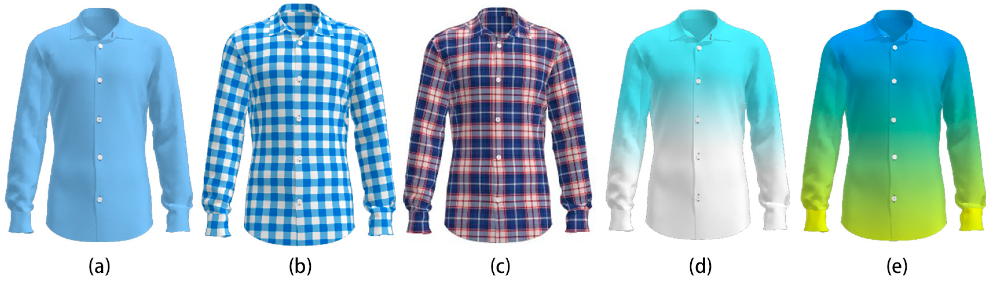
The shirt is a kind of common and popular fashion item among males and females, including solid color shirts, multi-color plaid shirts, and printed shirts with a color gradient, as shown in Figure 1. Compared with other shirts, solid color shirts do not have color gradients or combinations and patterns, and it is easier to find the potential relationships between these shirt color values and people’s preferences. Hence, in this paper, solid color shirts are selected as the research objects for the analysis of people’s perceptions and preferences concerning fashion colors, and we make the following contributions:
- We found the potential preference patterns related to male and female consumers for whom the hard-to-match/easy-to-match (HE) response was found to highly correlate with the dislike/like response, and both males and females had a similar response to cold/warm, heavy/light, and passive/active responses.
- We analyzed the aesthetic differences and similarities between males and females. The female’s response to HE had a strong correlation with two adjective pairs (plain/gaudy and slim-look/fat-look), while that of the male also had a strong correlation with two adjective pairs (plain/gaudy and masculine/feminine).
- We developed a hierarchical feed-forward model of aesthetic perception for solid color shirts. This model can predict the preference degree of solid color shirts by inputting the color values into the CIELAB color space.
2. Related Work
2.1. General Context Perception and Preference Analysis
The ability to appreciate the aesthetic qualities of the items, including colors, textures, and patterns, is one of the universal characteristics of humanity. Neuroaesthetics is the discipline of investigating how beauty activates aesthetic perception and appreciation. It is situated at the intersection of psychological aesthetics, neuroscience, and human evolution [14]. The main objective of neuroaesthetics is to “characterize the neurobiological foundations and evolutionary history of the cognitive and affective processes involved in aesthetic experiences and artistic and other creative activities” [15].
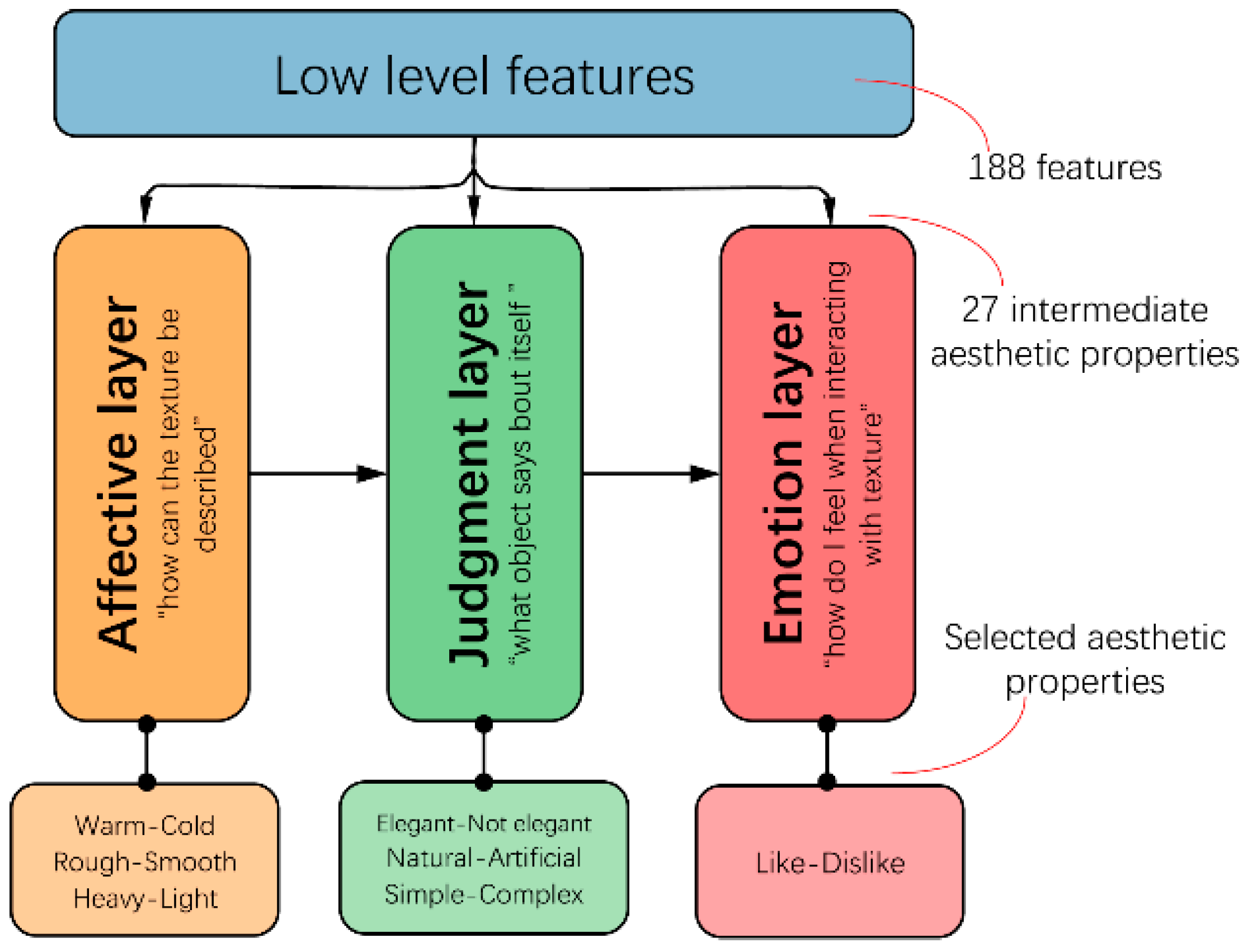
Most previous neuroaesthetic studies have focused on the investigation of the neural mechanisms underlying aesthetic appreciation as well as those factors that make up certain stimuli, such as the general visual arts, dance, the human face, and music. Over the past decade, several neutrally based and neutrally inspired models of aesthetic perception have been proposed, such as the neuropsychological model [16], the information-processing model [17,18], the mirror model of art [19], the quartet model of human emotion [20], the unifying model of visual aesthetic experience [21], and the hierarchical “feed-forward” model [22,23]. Among them, the first real mathematical model to bridge the gap between low-level statistical features and the aesthetic emotions aroused by visual textures was proposed by Thumfart and colleagues [23]. Using the results of a psychological experiment, they modeled the relationship between computational texture features and their aesthetic properties. In contrast to previous approaches, this layered model provided insight into the hierarchical relationships involved in the aesthetic experience of texture properties. The structure of the hierarchical feed-forward model of aesthetic texture perception consists of three layers: the affective layer (how the texture can be described), judgment layer (what the object says about itself), and emotional layer (what I feel when interacting with the texture) [23] (see Figure 2).
However, these proposed models are used for general context perception and preference analysis rather than a specific object, the colors of which are its main features. Hence, we still need to establish an effective model to bridge the gap between fashion colors and the aesthetic emotions aroused by visual colors.
2.2. Product Color Perception and Preference Analysis
Besides the textures and patterns of products and environments, during the color perception process an associated feeling or emotion is normally induced in our brains. The term “color emotion” was used recently by researchers in this field to represent this feeling or emotion. Many researchers have suggested that color directly affects the parts of a human’s nervous system that are responsible for the arousal of emotions, and different colors or color combinations usually have different meanings for people. As color emotion is in the domain of psychology, it is influenced by many factors, such as sex, age, climate, and geographic conditions, as well as race and cultural influences.
Many researchers have already investigated the relationship, in terms of adjective pairs, such as “heavy/light”, “passive/active”, and “cold/warm”, between color and the affective quality of the color itself (e.g., color patches) [24,25,26], as well as the effects of sex [27] and age [28,29] differences. Note that most of these color preference studies were based on color patches. Ou et al. and Xin et al. found that the “heavy/light”, “passive/active”, and “cold/warm” pairs had a high correlation with L*, C*, and hab of the color patches in the CIE LCh color space, respectively [24,25,26]. As pointed out by Norman and Scott [30], such studies do not measure the observer responses to color products, but rather to color patches. It is still unclear whether the observer responses to color patches can be generalized to real-world applications.
Colors have inherent features, like “heavy/light”, “passive/active”, and “cold/warm”, while the colors on the surface of different products and environments have different additional features, like “masculine/feminine”, “hard-to-match/easy-to-match”, and “traditional/fashionable”. There have only been a few studies on color preferences that used colored objects or environments as the stimuli, such as cars [31], textile or fabrics [32,33], residences [34], and room interiors [35]. However, color preference ratings are found to vary across different objects, suggesting a strong impact of context on color preferences [36].
Compared with other products, fashion is a much more common and ubiquitous product. Regarding previous research in relation to the present study, to the best of our knowledge, there has been no psychophysical research into color perception and fashion preferences with a specific content. Using the existing research findings of aesthetic perception models [22,23], and color emotion [24,25,26,29,37,38,39,40,41] as a theoretical basis, this study aims to discover the specific mechanism associated with fashion color perception and preference. Furthermore, the investigated clothing is three-dimensionally displayed, because the previous studies only investigated 2D fabric color preferences [32,33]. However, there is a difference of color preference between 2D fabric and 3D clothing. Hence, it is more reliable to investigate the color preference of 3D clothing with the help of 3D clothing simulation software.
3. Experimental Details
3.1. Current Solid Shirt Color Analysis
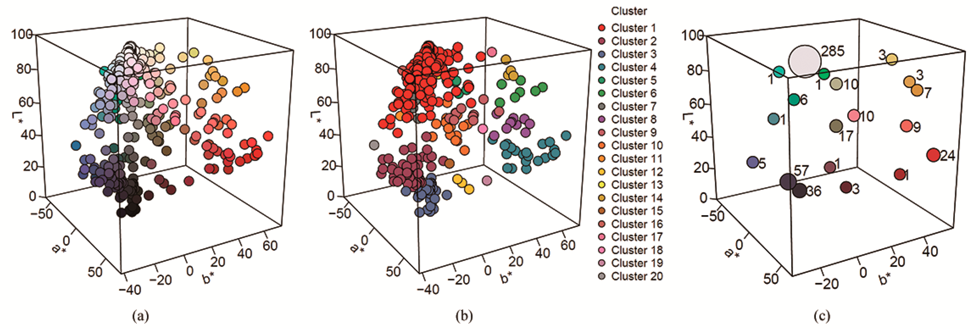
The colors of the test shirts used in the experiment were generated on the basis of the existing solid color shirts. We collected 480 colors of solid shirts from different clothing brands (shown in Figure 3a) and used the mean shift clustering algorithm [42] to classify them into 19 clusters in the CIELAB color space (shown in Figure 3b). Nineteen cluster centers and their corresponding numbers of clusters are shown in Figure 3c. White was the most popular color, followed by black and red.
3.2. Solid Color Scheme Designing
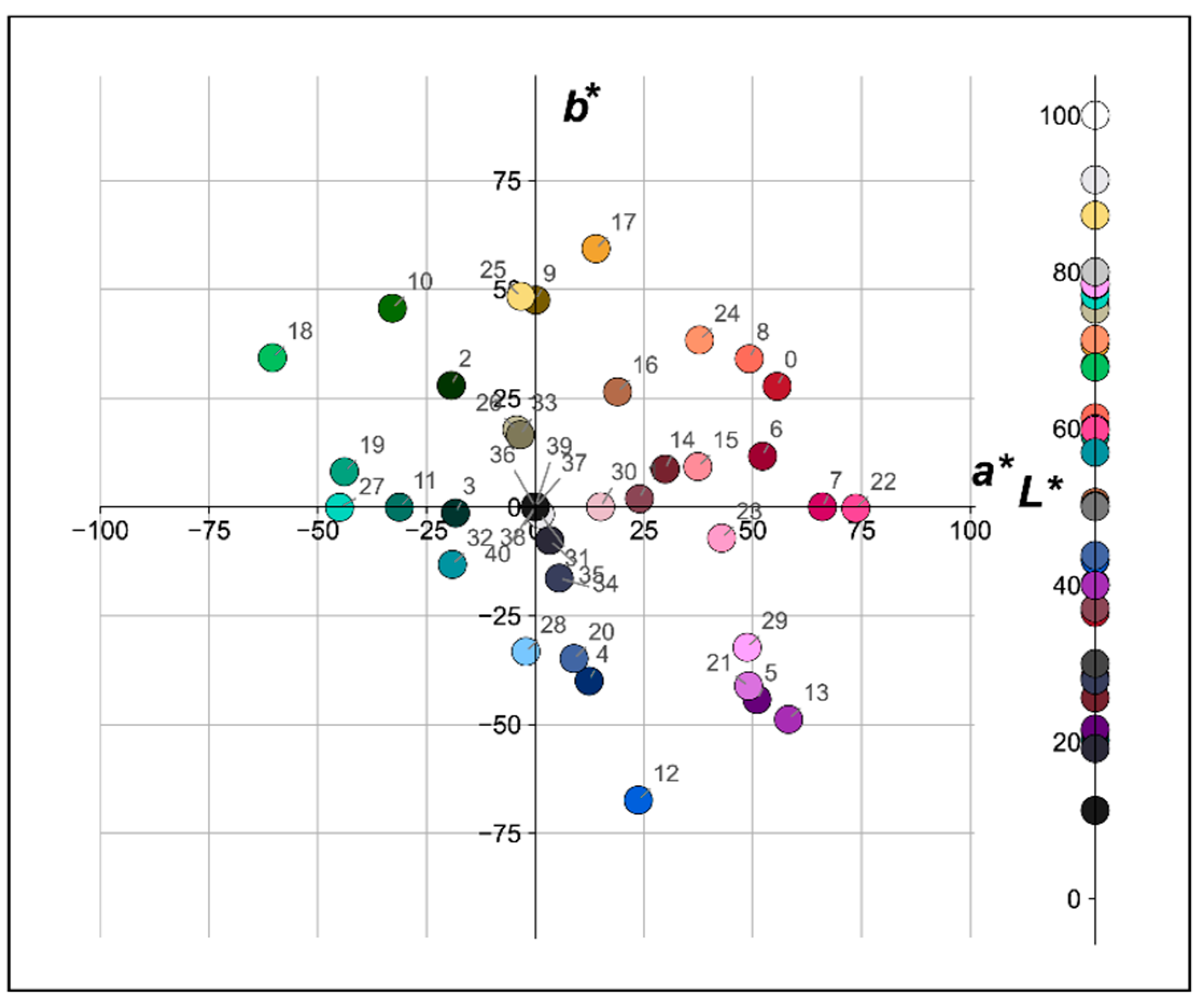
Based on the 19 colors of the clustering centers, another 22 solid colors were added to generate the solid color scheme, whose color values in the CIELAB color space are shown in Figure 4. In our study, the values in the CIELAB color space were used to describe the colors of the solid shirts. The CIELAB color space (also known as CIE L*a*b*, which is sometimes abbreviated as simply the “Lab” color space) is a color space, defined by the International Commission on Illumination (CIE) in 1976. It expresses color as three numerical values, L* for the lightness and a* and b* for the green-red and blue-yellow color components. CIELAB was designed to be perceptually uniform with respect to human color vision, meaning that the same amount of numerical change in these values corresponds to about the same amount of visually perceived change.
The CIELCh color space is a CIELAB cube color space where, instead of Cartesian coordinates a* and b*, the cylindrical coordinates C* (chroma, relative saturation) and hab (hue angle, angle of the hue in the CIELAB color wheel), are specified. The CIELAB lightness, L*, remains unchanged. The conversion of a* and b* into C* and hab is carried out using the following formulas:
To cover a reasonably wide range of lightness (L*), chroma (C*), and hue (hab) in CIELAB color space, and to cover the clustering centers of the existing solid shirt colors, 41 colors were selected.
3.3. Solid Color Shirt Simulation
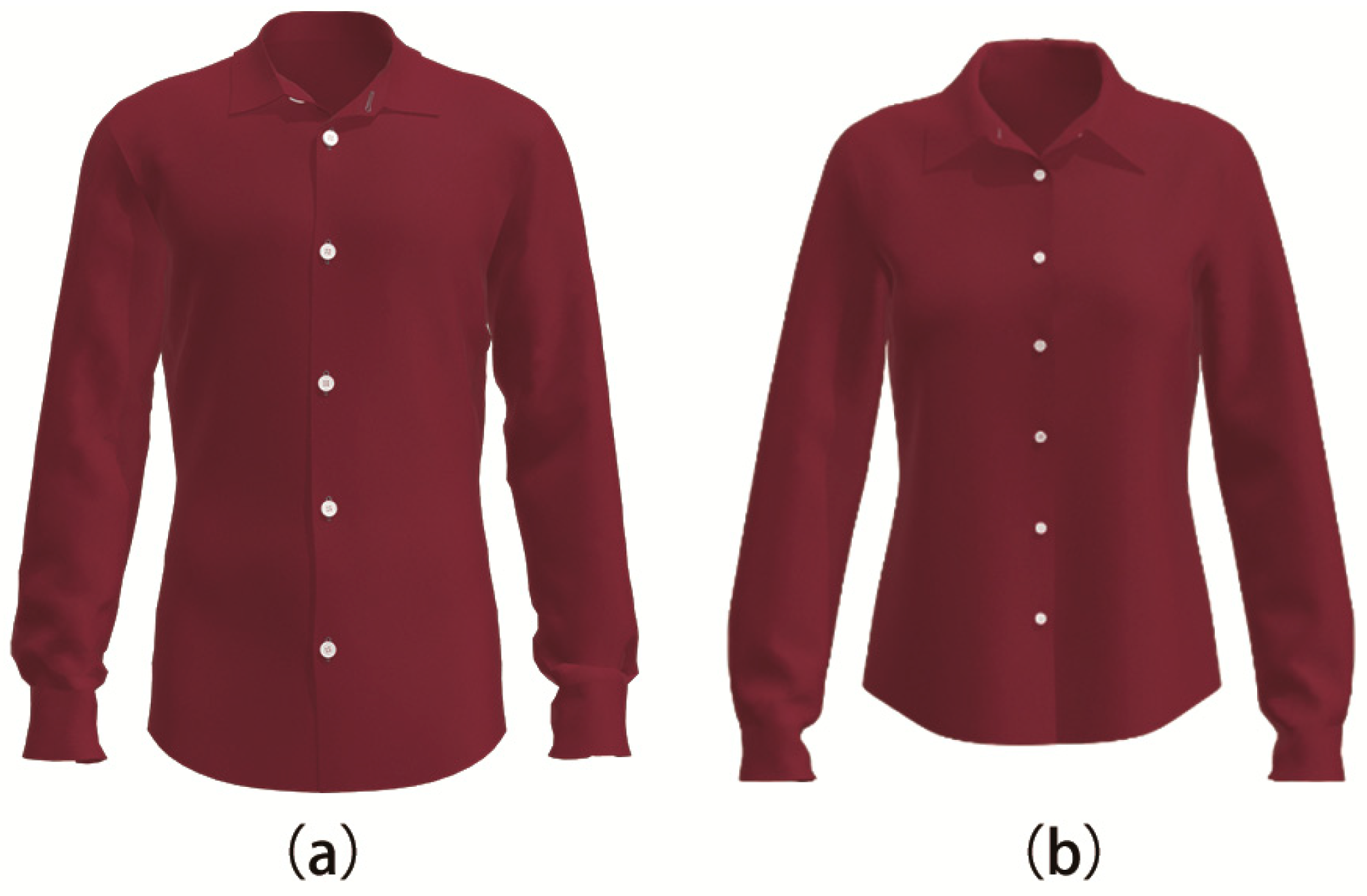
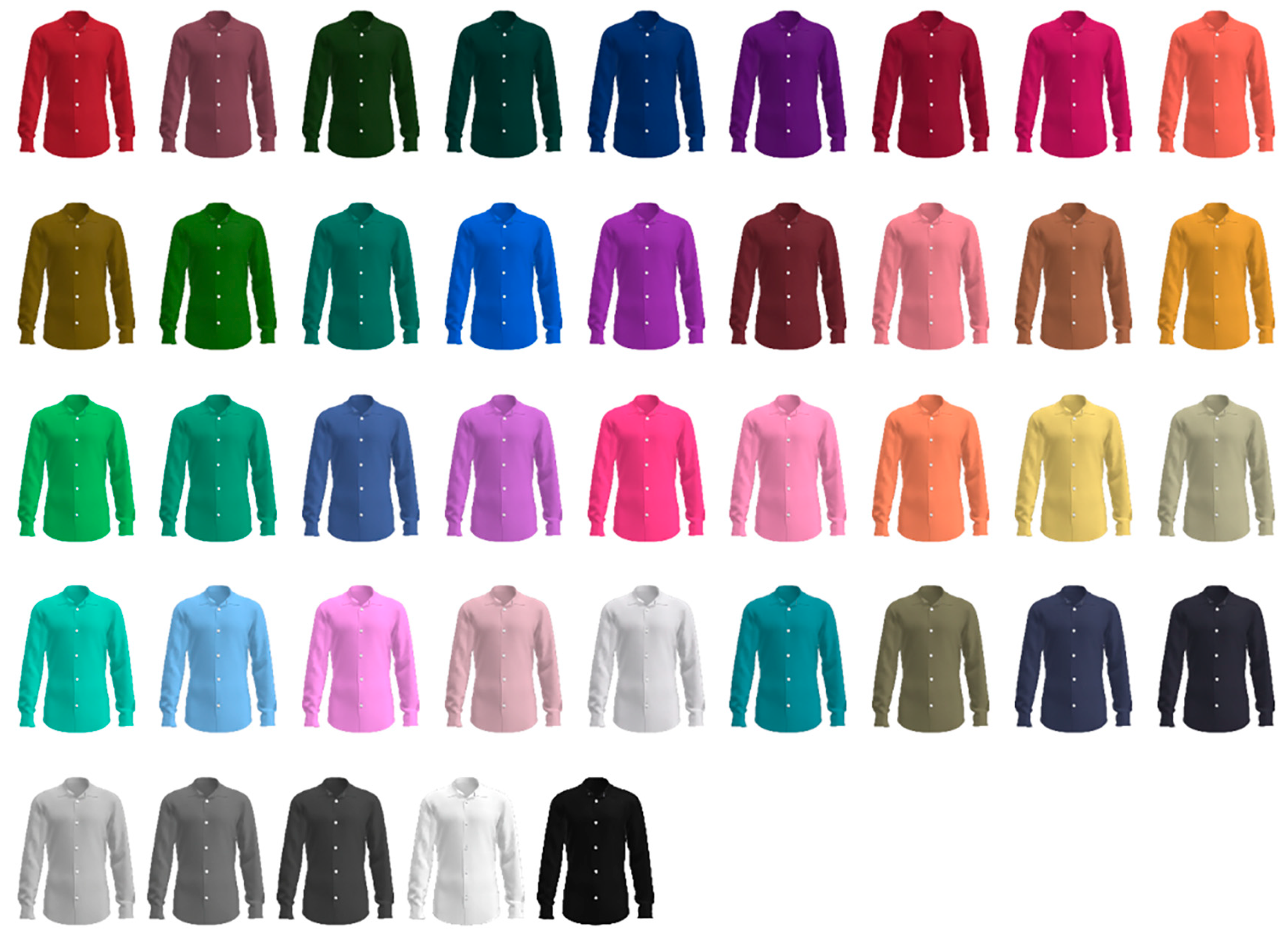
Based on the designed solid color scheme, CLO 3D software was used to simulate three-dimensional men’s and women’s shirts, as shown in Figure 5a,b, respectively (in which the image on the left is a basic type of men’s shirt for a man with a height of 175cm, and the image on the right is a basic type of women’s shirt for a woman with a height of 165cm). Figure 6 shows 41 male shirts, the colors of which correspond to the selected colors, shown in Figure 4.
3.4. Semantic Scales Designing
We collected a multitude of adjective pairs related to solid color shirts. Eleven adjective pairs were selected on the basis of a questionnaire survey, where 10 participants were each asked to select 10 adjectives appropriate to describing their visual impressions of solid color shirts. Among them, nine adjectives, including “Cold:Warm”, “Heavy:Light” “Passive:Active” [24,25], “Dirty:Clean” [24], “Tense:Relaxed” [24], “Plain:Gaudy” [26], “Traditional:Modern”, “Masculine:Feminine” [24], and “Dislike:Like” [24], were drawn from existing studies. Additionally, another two scales, “Slim-Look:Fat-Look” and “Hard-to-Match:Easy-to-Match,” were drawn from the participants’ lists with high frequencies.
Additionally, “Cold:Warm” [22,23], “Plain:Gaudy” [26], and “Traditional:Modern” [22,32] were sometimes replaced by “Cool:Warm” [24,25,26,32], “Plain:Splendid” [32], and “Plain:Luxury” [43], or “Plain:Gallant”, respectively, [22]. “Classic:Modern” [24] was sometimes replaced with “Old-fashioned:Modern” [23] or “Ancient:Modern” [22], respectively.
During the main experiment, each word pair was presented using a seven-step, forced choice scale to measure the observer response. Taking “Dislike:Like” as an example, the seven steps included “dislike extremely”, “dislike”, “dislike somewhat”, “neither like nor dislike”, “like somewhat”, “like”, and “like extremely”. A certain number of female and male observers were asked to fill in the same seven-step mandatory scale with multiple-choice questions to assess the 41 shirts.
3.5. Visual Experiments Implementation
In the experiment, this study used two Apple 27-inch iMacs (model: MD095CH/A) as the display. The two monitors were under the same indoor environment and light source. During the experiment, other interference factors were avoided, and the same brightness and display calibration were set for the two monitors to mitigate color distortion as much as possible. During the test, an image was displayed for 10 s to avoid interference with the next image.
A panel of 34 Chinese observers (17 males and 17 females) who had basic knowledge about color or design took part in the experiment. They were all design majors and received color training or courses related to color during their studies. There were 7 males and 5 females aged between 18 and 25, while 10 males and 12 females were aged between 25 and 33. During the experiment, each observer was asked to sit in front of the experimental display with a viewing distance of about 50 cm.
4. Results Analysis and Discussion
4.1. Variance Analysis
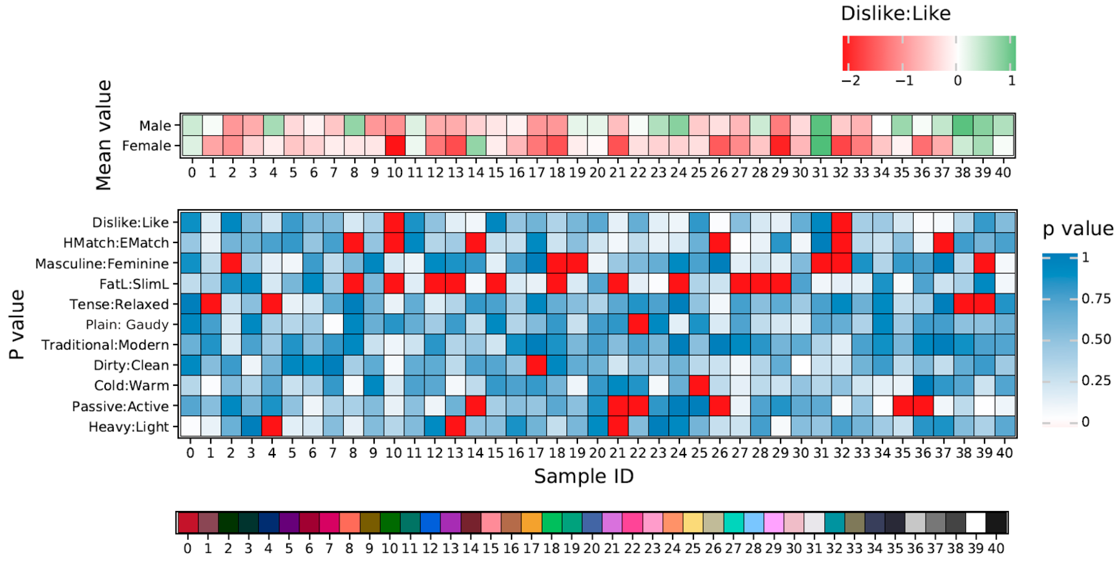
Gender variance analysis. It is important to know the difference of semantic scales between males and females. Hence, an independent sample t-test was used to analyze the differences in semantic scales for different solid color shirts from the viewpoint of gender, as shown in Figure 7.
In Figure 7, the block (i, j) in the middle heat map shows the gender difference of the ith semantic scale for the jth solid color shirt, where I = 1, 2,…, 10 and j = 0, 2,…, 40. Especially, the red block in the middle heat map indicated that the significant difference p was less than 0.05, which meant that there was significant difference of semantic scale between males and females in terms of solid color shirts. The results showed that observers of different genders did not have significant differences of aesthetic emotions (p > 0.05) in relation to different solid color shirts, besides “FatL:SlimL” (slim-look/fat-look), which indicated that different genders had nearly consistent aesthetic emotions for different solid color shirts.
In Figure 7, the top heat map shows the mean values of the semantic scales of color preference (“Dislike:Like”). The females and males had a positive preference for white and black colors. Especially, the values of the female’s response to “Dislike:Like” were slightly lower than that of males for most colors, which meant that females were more selective concerning fashion than males.
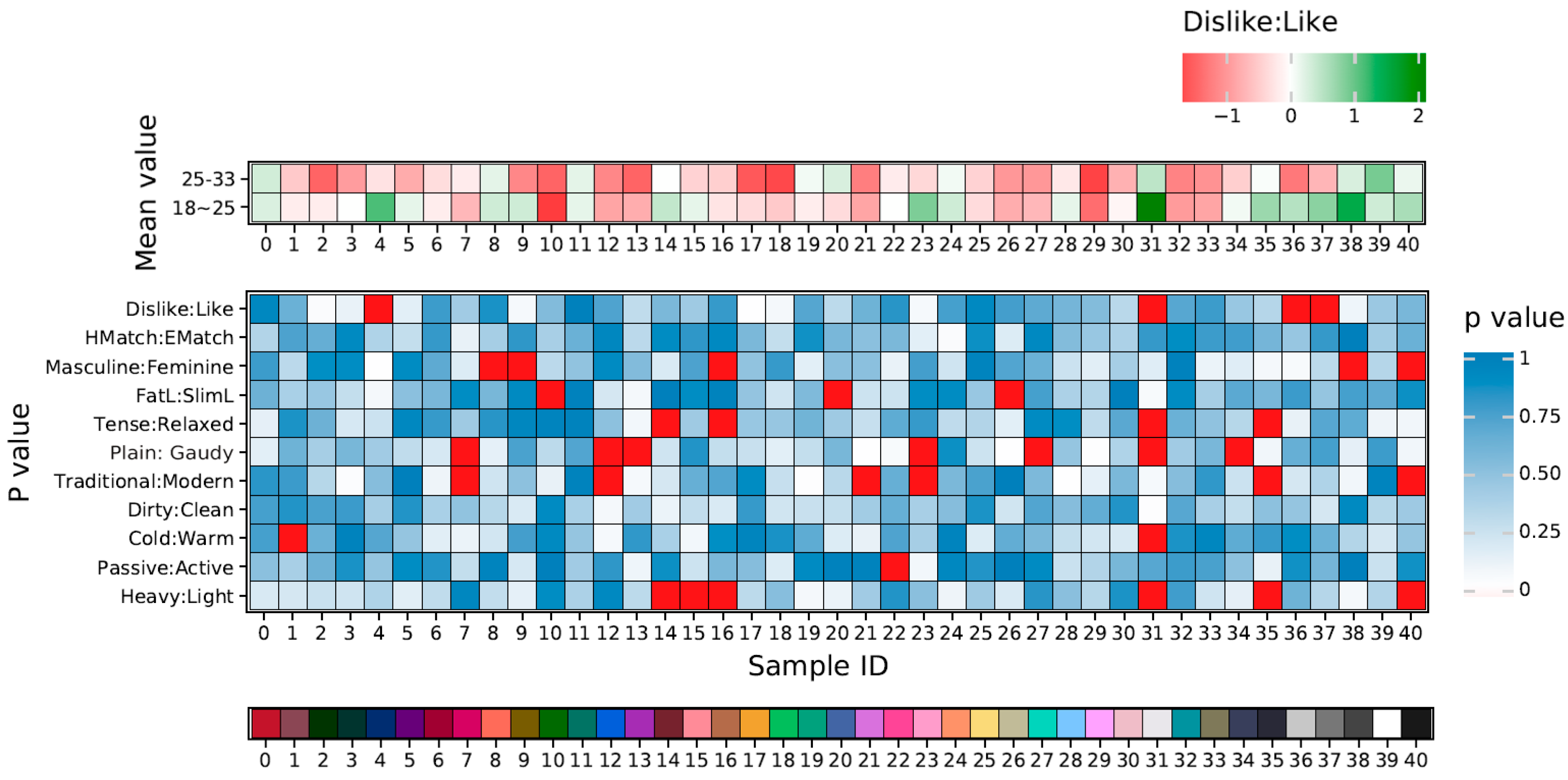
Age variance analysis. It is important to know the difference of semantic scale among people with different ages. Therefore, an independent sample t-test was used to analyze the differences in semantic scale for different solid color shirts from the viewpoint of age, as shown in Figure 8. The observers were classified into two groups: 18–25 years and 25–33 years, with 12 and 22 observers in each group, respectively.
In Figure 8, the block (i, j) in the middle heat map shows the age difference of the ith semantic scale for the jth solid color shirt, where i = 1, 2,…, 10 and j = 0, 2,…, 40. Especially, the red block in the middle heat map indicated that the significant difference p was less than 0.05, which meant that there was a significant difference of aesthetic emotions among different age groups in terms of solid color shirts. The results showed that observers of different ages did not have a significant difference of semantic scale (p > 0.05) for different solid color shirts, except for the 14th dark red, the 31st white, and the 35th and 40th black samples, in response to which different ages had nearly consistent aesthetic emotions for different solid color shirts.
In Figure 8, the top heat map shows the mean values of the semantic scales of color preference (“Dislike:Like”). The different age groups had a positive preference for white and black colors. Especially, the values of the response to “Dislike:Like” were slightly greater in the 18–25 age group than that of the 25–33 age group for most colors, which meant younger people were more sensitive to color.
4.2. Correlation and Regression Analysis
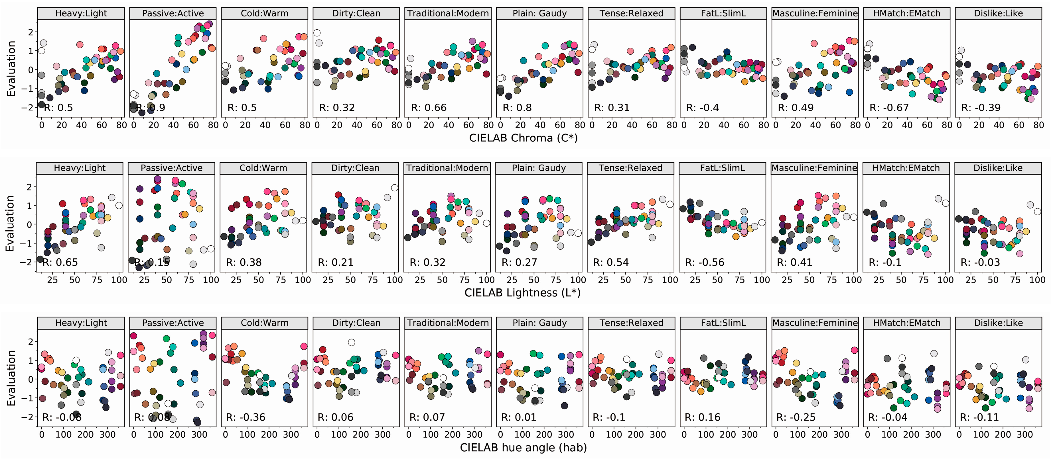
It is possible and significant to quantify the aesthetic emotions of solid color shirts and confirm the relationship between color values and aesthetic emotions. The relationship between the CIE LCh values and semantic scales is shown in Figure 9. In Figure 9, compared with other semantic scales, the observers’ responses to “Heavy:Light” and “Passive:Active” had the highest linear correlation with the L* and C*, respectively. Compared with other semantic scales, observer responses to “Cold:Warm” had a strong nonlinear correlation with hab. The value of the response to “Cold:Warm” decreased along with hab, reaching the lowest point at an hab of around 250°, and then increased. Based on the universal models of color emotion and color harmony, developed by Ou et al. [25], the fitting equations of the perceived “Heavy:Light”, “Passive:Active” and “Cold:Warm” responses, as the three basic semantic scales, were confirmed and illustrated in Table 2 by the regression analysis method.
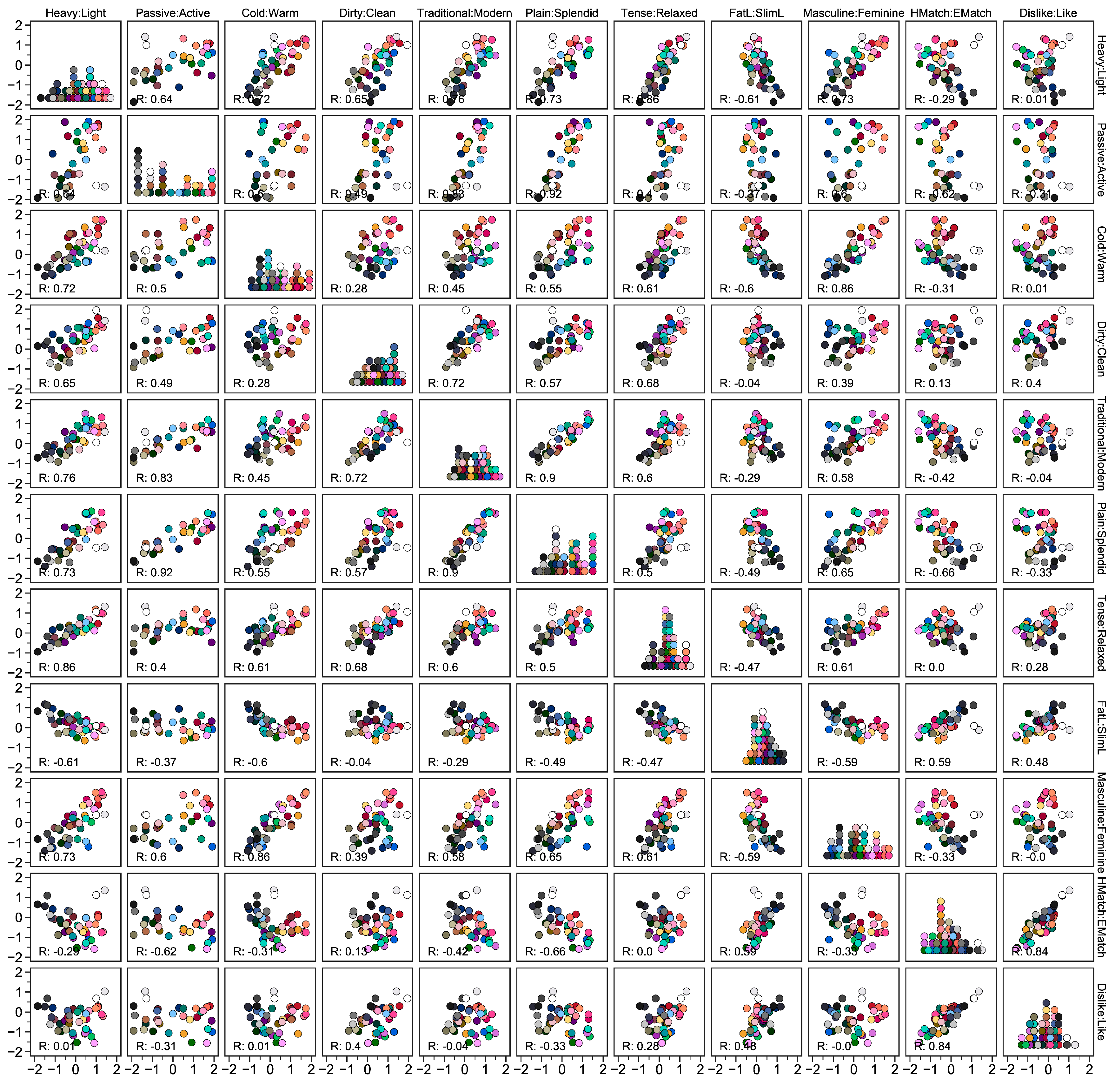
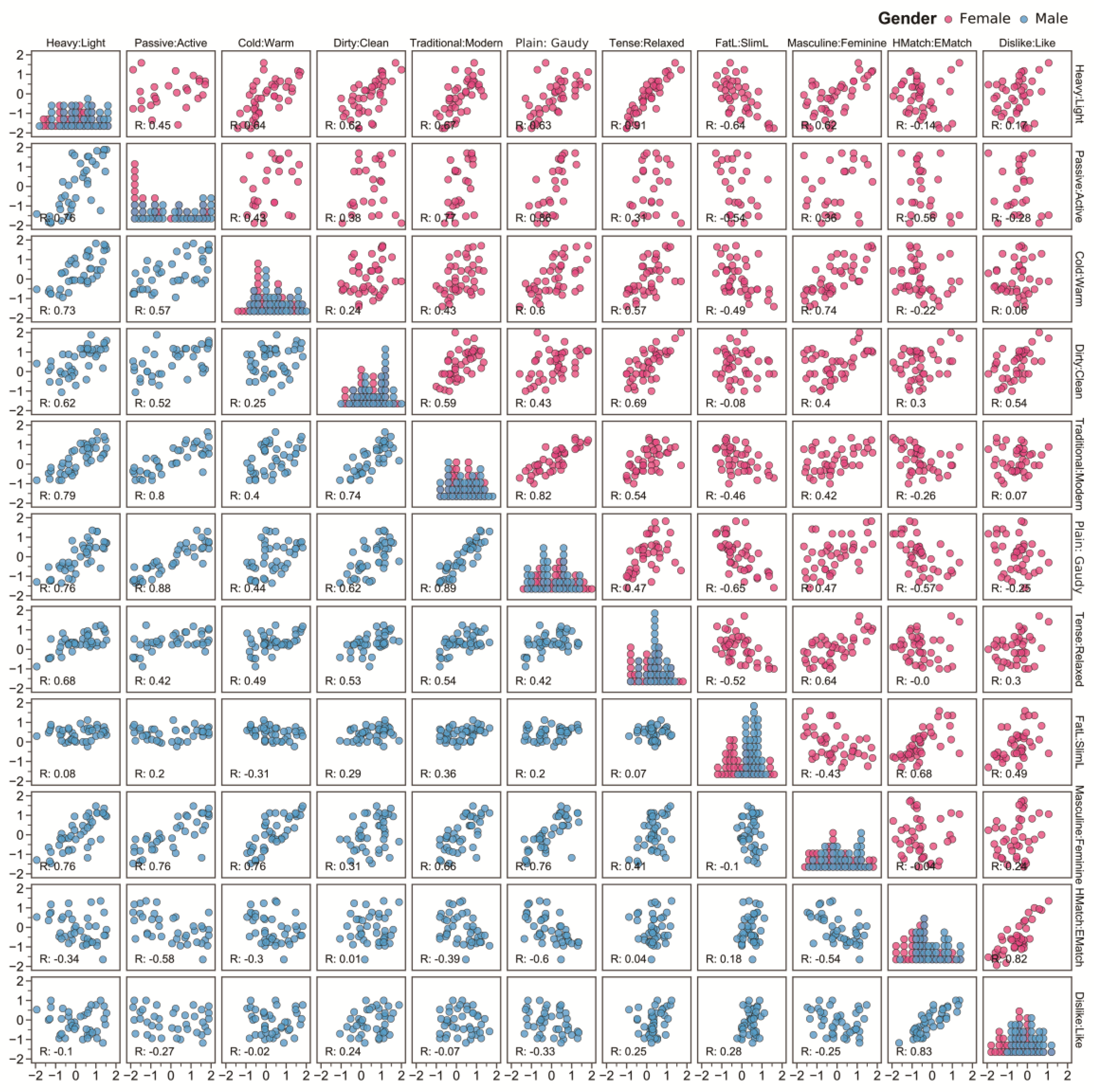
The scatterplot matrix of average values of semantic scales is shown in Figure 10. In Figure 10, the perceived “HMatch:EMatch” (“Hard-to-Match:Easy-to-Match”) was found to be highly correlated with “Dislike:Like”. The gender variance analysis results of Figure 7 showed that observers of different genders showed a significant difference of “FatL:SlimL” (Slim-Look:Fat-Look) (p < 0.05) for different solid color shirts. Hence, Figure 11 shows the scatterplot matrix of semantic scales for females and males. It could be found that the perceived “HMatch:EMatch” was mainly affected by the “Plain:Gaudy” and “Slim-Look:Fat-Look” for females, and the “Plain:Gaudy” and “Masculine:Feminine” for males. Furthermore, the perceived “FatL:SlimL” and “Masculine:Feminine” had a linear correlation with the three basic semantic scales.
The internal relationship of semantic scales is shown in Table 1. R indicates the Pearson correlation coefficient. In Table 1, the semantic scales connected with “Dislike:Like,” directly or indirectly, were taken into consideration, including “HMatch:EMatch”, “FatL:SlimL”, “Masculine:Feminine”, and “Plain:Gaudy”, while the semantic scales that did not affect the response “Dislike:Like” were ignored in the data analysis, including “Dirty:Clean”, “Traditional:Modern”, and “Tense:Relaxed”.
Interestingly, from these variance and correlation analyses, it could be found that:
- People’s attitudes towards solid color shirts were mainly affected by whether the shirts were easy to match or not. Compared with the shirts that were hard to match, people preferred solid color shirts that were easy to match, which indicated that people dislike taking a lot of time to match clothing, or that they did not know how to match their clothing.
- Females preferred solid color shirts that could make them look slim and that were easy to match.
- Males preferred solid color shirts that could make them look masculine and were easy to match.
- Compared with gaudy shirts, both females and males preferred plain shirts. Clothing that was too gaudy could be hard to match.
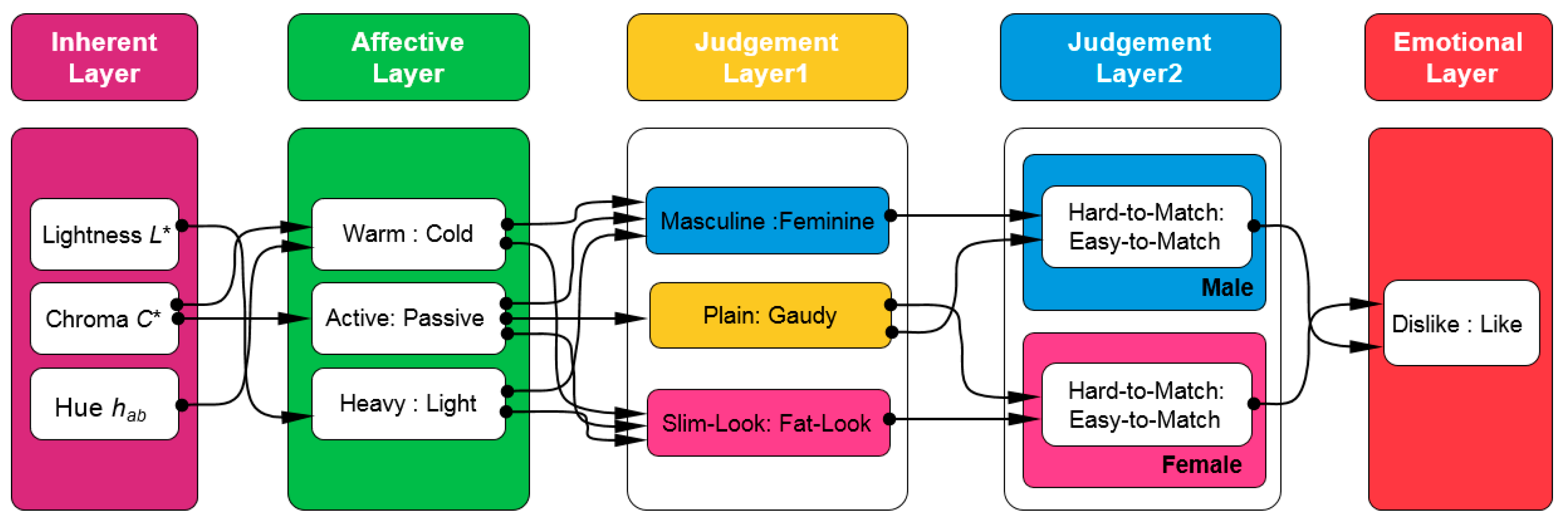
Based on the hierarchical feed-forward theory of aesthetic perception [22,23], a hierarchical feed-forward model of aesthetic perception for solid color shirts was developed from Table 1, as shown in Figure 12. A hierarchical feed-forward model with five layers was established. The inherent layer consisted of three values in the CIELCh color space, and there were three adjective pairs: “Heavy:Light”, “Passive:Active”, and “Cold:Warm”, which had the strongest link with L*, C*, and hab, respectively. The judgement layer 1 also had three adjective pairs: “Plain:Gaudy”, “Masculine:Feminine” (only for males), and “Slim-Look:Fat-Look” (only for females), while the judgement layer 2 only had “Hard-to-Match:Easy-to-Match” for males and females, respectively. The final emotion layer was used to output people’s preference degree. Furthermore, the regression analysis method was used to confirm the regression equation among these layers, as shown in Table 2. The coefficient in each regression equation was calculated by using the least square method to fit the psychophysical data. The predictive performance of each equation in terms of the correlation coefficient of determination R2 is also given in Table 2.
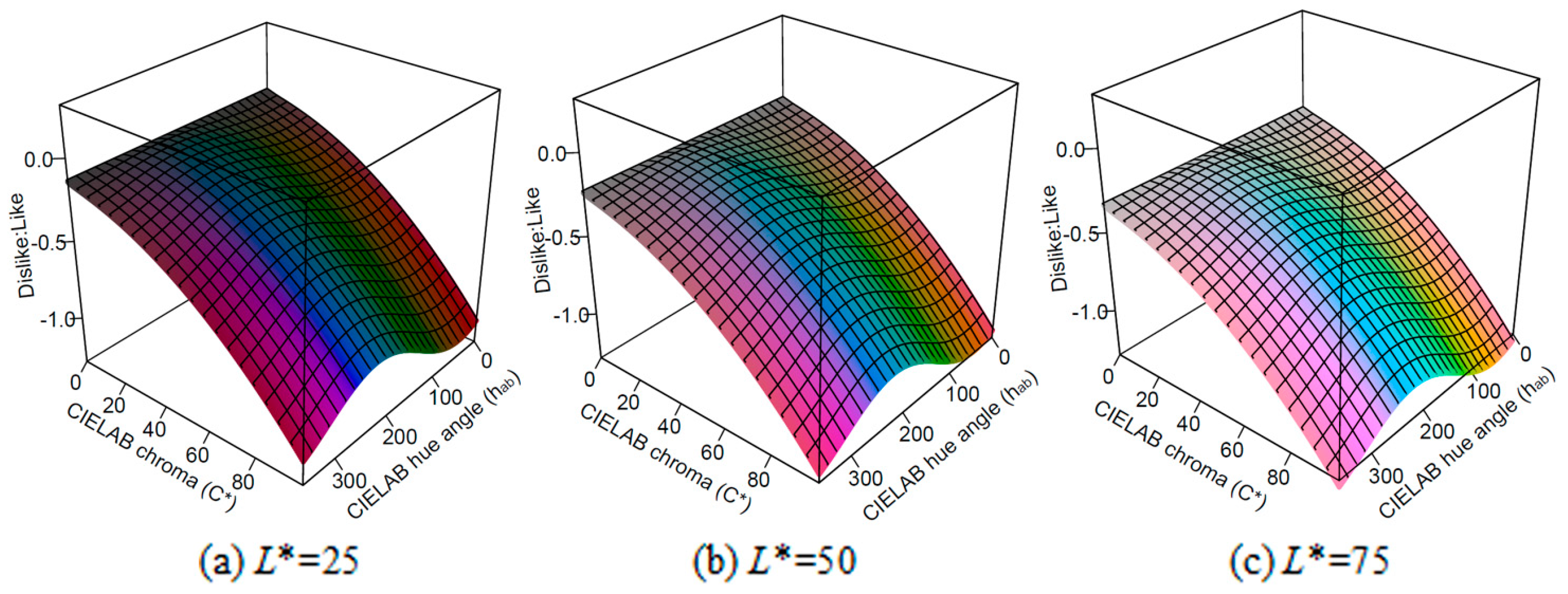
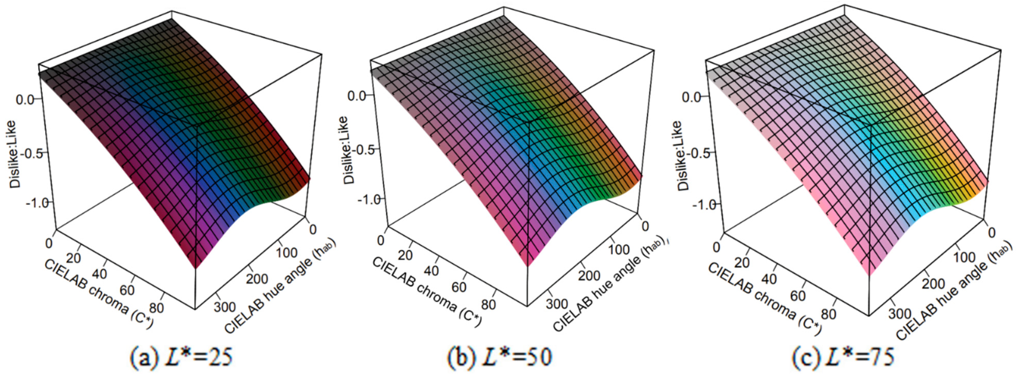
The hierarchical feed-forward model of aesthetic perception for solid color shirts can predict the color preference degree for females and males, when L*, C*, and hab are inputted. When the L* are 25, 50, and 75, respectively, the color preference degree changes with the value of C* and hab for females and males, as shown in Figure 13 and Figure 14, respectively. Furthermore, there were some interesting patterns, generated by the developed model, that we could find from Figure 13 and Figure 14:
- The preference degree (“Dislike:Like”) of a color for females was usually lower than that for males, which was consistent with the former conclusion that females were fussier about fashion than males.
- The blue color, whose hab was about 270, was more popular, compared with other colors, when their chroma C* and lightness L* were the same.
- The bigger the lightness L* of a color, the bigger the preference degree, when its C* and hab were the same.
- The smaller the chroma C* of a color, the bigger the preference degree, when its L* and hab were the same.
4.3. Research Limitations
Besides solid color shirts, the aesthetic perception for shirts of other patterns also needs to be investigated using the transfer learning method [44], based on the developed model, including two-color, multi-color, and one-color gradient shirts, as shown in Figure 1.
For shirts of these colors, some other color features and aesthetic properties should be taken into consideration in the hierarchical feed-forward model, such as the maximum and mean color difference in the inherent layer, and “Unharmonious:Harmonious” and “Simple:Complex” in the affective layer. Compared with the solid color shirts, the harmonious degree of the color combination and the complexity of the color pattern are important for two-color and multi-color shirts, and the color gradients of the one-color gradient shirts and the harmonious degree of the two-color gradient shirts are also significant aesthetic properties.
5. Conclusions
Based on the psychophysical data, a hierarchical feed-forward model of aesthetic perception for solid color shirts was developed, and the aesthetic differences and similarities between male and female were also analyzed in this paper. Especially, it was found that females preferred solid color shirts that could make them look slim and were easy to match, while males did not take the slimness factor into consideration at all, preferring solid color shirts that could make them look masculine and were easy to match. Furthermore, the proposed model could be used to predict the preference degree of a color.
This paper focuses on the colors of solid color shirts and does not consider clothing styles, textures, and materials, which is one research limitation. The other limitation of this study is that all of the observers are Chinese people, who have some fundamental knowledge about color. This is a very specific consumer group that cannot be used directly to translate the results into universal consumer preferences concerning fashion colors. However, it is not hard to analyze the fashion color preferences of consumers of different ages and nationalities using the transfer learning method, based on the developed model. In the future, we will attempt to improve the proposed hierarchical feed-forward model of aesthetic perception and make it suitable for shirts of other colors and other types of clothing as well.
Author Contributions
All authors contributed to the paper. Q.J. and J.Z. collected and organized data; Q.J. wrote the manuscript with the supervision from L.-C.C. and J.Z.; and J.Z. acted as a corresponding author.
Funding
This research received no external funding.
Data Availability Statement
The datasets analyzed in this study are publicly available. Both the data and codes pertaining to this study have been released and can be accessed at the following link: https://github.com/Easy-Shu/Color_Preference_Analysis.
Conflicts of Interest
The authors declare no conflict of interest.
References
- Elven, M.V. People Do Not Wear at Least 50 Percent of Their Wardrobes, Says Study. Available online: https://fashionunited.uk/news/fashion/people-do-not-wear-at-least-50-percent-of-their-wardrobes-according-to-study/2018081638356 (accessed on 11 March 2019).
- Rehman, H. Fashion Is the World’s 2nd Most Polluting Industry After Oil. Available online: https://www.linkedin.com/pulse/fashion-worlds-2nd-most-polluting-industry-after-oil-heidy-rehman (accessed on 11 March 2019).
- Nagamachi, M. Kansei engineering as a powerful consumer-oriented technology for product development. Appl. Ergon. 2002, 33, 289–294. [Google Scholar] [CrossRef]
- McLennan, J.F. The Philosophy of Sustainable Design: The future of Architecture; Ecotone Publishing: West Sacramento, CA, USA, 2004. [Google Scholar]
- Jiang, Q.; Chen, L.-C.; Yang, C.; Zhang, J. Pattern Preference Analysis of Black-and-White Plaid Shirts. Sustainability 2018, 10, 3739. [Google Scholar] [CrossRef]
- Christopher, M.; Lowson, R.; Peck, H. Creating agile supply chains in the fashion industry. Int. J. Retail Distrib. Manag. 2004, 32, 367–376. [Google Scholar]
- Tsou, P.H. The current situation of the development of Taiwan’s apparel market. Mod. Mater. Handing Logist. 2012, 60, 47–48. (In Chinese) [Google Scholar]
- Sun, Z.-L.; Choi, T.-M.; Au, K.-F.; Yu, Y. Sales forecasting using extreme learning machine with applications in fashion retailing. Decis. Support Syst. 2008, 46, 411–419. [Google Scholar] [CrossRef]
- Singh, S. Impact of color on marketing. Manag. Decis. 2006, 44, 783–789. [Google Scholar] [CrossRef]
- Hillenbrand, P.; Alcauter, S.; Cervantes, J.; Barrios, F. Better branding: Brand names can influence consumer choice. J. Prod. Brand Manag. 2013, 22, 300–308. [Google Scholar] [CrossRef]
- Choi, H.H.; Lim, S.A.; HeeKim, J. Promotional Video of Editing Techniques Utilizing Color and Brand Balance. Int. J. Softw. Eng. Appl. 2014, 8, 149–158. [Google Scholar]
- Labrecque, L.I.; Patrick, V.M.; Milne, G.R. The marketers’ prismatic palette: A review of color research and future directions. Psychol. Mark. 2013, 30, 187–202. [Google Scholar] [CrossRef]
- Funk, D.; Oly Ndubisi, N. Colour and product choice: A study of gender roles. Manag. Res. News 2006, 29, 41–52. [Google Scholar] [CrossRef]
- Bundgaard, P.F. Feeling, meaning, and intentionality—A critique of the neuroaesthetics of beauty. Phenomenol. Cogn. Sci. 2015, 14, 781–801. [Google Scholar] [CrossRef]
- Chatterjee, A. Neuroaesthetics: A coming of age story. J. Cogn. Neurosci. 2011, 23, 53–62. [Google Scholar] [CrossRef] [PubMed]
- Chatterjee, A. Prospects for a cognitive neuroscience of visual aesthetics. Bull. Psychol. Arts 2003, 4, 55–60. [Google Scholar] [CrossRef]
- Leder, H. Next steps in neuroaesthetics: Which processes and processing stages to study? Psychol. Aesthet. Creat. Arts 2013, 7, 27–37. [Google Scholar] [CrossRef]
- Leder, H.; Belke, B.; Oeberst, A.; Augustin, D. A model of aesthetic appreciation and aesthetic judgments. Br. J. Psychol. 2004, 95, 489–508. [Google Scholar] [CrossRef]
- Tinio, P.P. From artistic creation to aesthetic reception: The mirror model of art. Psychol. Aesthet. Creat. Arts 2013, 7, 265–275. [Google Scholar] [CrossRef]
- Koelsch, S.; Jacobs, A.M.; Menninghaus, W.; Liebal, K.; Klann-Delius, G.; von Scheve, C.; Gebauer, G. The quartet theory of human emotions: An integrative and neurofunctional model. Phys. Life Rev. 2015, 13, 1–27. [Google Scholar] [CrossRef]
- Redies, C. Combining universal beauty and cultural context in a unifying model of visual aesthetic experience. Front. Hum. Neurosci. 2015, 9, 218. [Google Scholar] [CrossRef] [PubMed]
- Liu, J.L.; Lughofer, E.; Zeng, X.Y. Could linear model bridge the gap between low-level statistical features and aesthetic emotions of visual textures? Neurocomputing 2015, 168, 947–960. [Google Scholar] [CrossRef]
- Thumfart, S.; Jacobs, R.H.A.H.; Lughofer, E.; Eitzinger, C.; Cornelissen, F.W.; Groissboeck, W.; Richter, R. Modeling Human Aesthetic Perception of Visual Textures. ACM Trans. Appl. Percept. 2011, 8. [Google Scholar] [CrossRef]
- Ou, L.C.; Luo, M.R.; Woodcock, A.; Wright, A. A study of colour emotion and colour preference. Part I: Colour emotions for single colours. Color Res. Appl. 2004, 29, 232–240. [Google Scholar] [CrossRef]
- Ou, L.C.; Yuan, Y.; Sato, T.; Lee, W.Y.; Szabó, F.; Sueeprasan, S.; Huertas, R. Universal models of colour emotion and colour harmony. Color Res. Appl. 2018, 43, 736–748. [Google Scholar] [CrossRef]
- Xin, J.H.; Cheng, K.M.; Taylor, G.; Sato, T.; Hansuebsai, A. Cross-regional comparison of colour emotions part I: Quantitative analysis. Color Res. Appl. 2004, 29, 451–457. [Google Scholar] [CrossRef]
- Hurlbert, A.C.; Ling, Y. Biological components of sex differences in color preference. Curr. Biol. 2007, 17, R623–R625. [Google Scholar] [CrossRef] [PubMed]
- Beke, L.; Kutas, G.; Kwak, Y.; Sung, G.Y.; Park, D.S.; Bodrogi, P. Color preference of aged observers compared to young observers. Color Res. Appl. 2008, 33, 381–394. [Google Scholar]
- Ou, L.C.; Luo, M.R.; Sun, P.L.; Hu, N.C.; Chen, H.S. Age effects on colour emotion, preference, and harmony. Color Res. Appl. 2012, 37, 92–105. [Google Scholar] [CrossRef]
- Norman, R.D.; Scott, W.A. Color and affect: A review and semantic evaluation. J. Gen. Psychol. 1952, 46, 185–223. [Google Scholar] [CrossRef]
- Saito, T. Latent spaces of color preference with and without a context: Using the shape of an automobile as the context. Color Res. Appl. 1983, 8, 101–113. [Google Scholar] [CrossRef]
- Hsu, M.Y.; Ou, L.C.; Guan, S.S. Colour preference for Taiwanese floral pattern fabrics. Color Res. Appl. 2016, 41, 43–55. [Google Scholar] [CrossRef]
- Kim, E.Y.; Kim, S.J.; Koo, H.J.; Jeong, K.; Kim, J.I. Emotion-based textile indexing using colors and texture. In Proceedings of the International Conference on Fuzzy Systems and Knowledge Discovery, Changsha, China, 27–29 August 2005; Volume 3613, pp. 1077–1080. [Google Scholar]
- Manav, B. Color-emotion associations and color preferences: A case study for residences. Color Res. Appl. 2007, 32, 144–150. [Google Scholar] [CrossRef]
- Yildirim, K.; Hidayetoglu, M.L.; Capanoglu, A. Effects of interior colors on mood and preference: Comparisons of two living rooms. Percept. Mot. Skills 2011, 112, 509–524. [Google Scholar] [CrossRef] [PubMed]
- Schloss, K.B.; Strauss, E.D.; Palmer, S.E. Object color preferences. Color Res. Appl. 2013, 38, 393–411. [Google Scholar]
- Ou, L.C.; Luo, M.R.; Woodcock, A.; Wright, A. A study of colour emotion and colour preference. Part III: Colour preference modeling. Color Res. Appl. 2004, 29, 381–389. [Google Scholar] [CrossRef]
- Ou, L.C.; Luo, M.R.; Woodcock, A.; Wright, A. A study of colour emotion and colour preference. part II: Colour emotions for two-colour combinations. Color Res. Appl. 2004, 29, 292–298. [Google Scholar] [CrossRef]
- Xin, J.; Cheng, K.; Taylor, G.; Sato, T.; Hansuebsai, A. Cross-regional comparison of colour emotions Part II: Qualitative analysis. Color Res. Appl. 2004, 29, 458–466. [Google Scholar] [CrossRef]
- Ou, L.C.; Ronnier Luo, M.; Sun, P.L.; Hu, N.C.; Chen, H.S.; Guan, S.S.; Woodcock, A.; Caivano, J.L.; Huertas, R.; Treméau, A. A cross-cultural comparison of colour emotion for two-colour combinations. Color Res. Appl. 2012, 37, 23–43. [Google Scholar] [CrossRef]
- Szabo, F.; Bodrogi, P.; Schanda, J. Experimental modeling of colour harmony. Color Res. Appl. 2010, 35, 34–49. [Google Scholar] [CrossRef]
- Comaniciu, D.; Meer, P. Mean shift: A robust approach toward feature space analysis. IEEE Trans. Pattern Anal. Mach. Intell. 2002, 24, 603–619. [Google Scholar] [CrossRef]
- Lee, W.Y.; Pai, S.Y. The affective feelings of colored typefaces. Color Res. Appl. 2012, 37, 367–374. [Google Scholar] [CrossRef]
- Tsung, F.; Zhang, K.; Cheng, L.; Song, Z. Statistical transfer learning: A review and some extensions to statistical process control. Qual. Eng. 2018, 30, 115–128. [Google Scholar] [CrossRef]
Figure 1.
Examples of various color shirts. (a) Solid color. (b) Two-color combination. (c) Multi-color combination. (d) One-color gradient. (e) Two-color gradient.
Figure 1.
Examples of various color shirts. (a) Solid color. (b) Two-color combination. (c) Multi-color combination. (d) One-color gradient. (e) Two-color gradient.

Figure 2.
The structure of the hierarchical feed-forward model of aesthetic perception [23].
Figure 2.
The structure of the hierarchical feed-forward model of aesthetic perception [23].

Figure 3.
Clustering results of solid shirt colors. (a) Original colors. (b) Clustering results. (c) Clustering centers.
Figure 3.
Clustering results of solid shirt colors. (a) Original colors. (b) Clustering results. (c) Clustering centers.

Figure 4.
Selected solid colors in the CIE LAB color space.

Figure 5.
Simulated shirt. (a) Male shirt. (b) Female shirt.

Figure 6.
3D-simulated male shirts.

Figure 7.
Independent sample t-test from the viewpoint of gender. (“FatL:SlimL” indicates “Slim-Look:Fat-Look”, and “HMatch:Ematch” indicates “Hard-to-Match:Easy-to-Match”).
Figure 7.
Independent sample t-test from the viewpoint of gender. (“FatL:SlimL” indicates “Slim-Look:Fat-Look”, and “HMatch:Ematch” indicates “Hard-to-Match:Easy-to-Match”).

Figure 8.
Independent sample t-test from the viewpoint of age.

Figure 9.
The correlation between the CIE LCh values and 11 semantic scales.

Figure 10.
The scatterplot matrix of semantic scales.

Figure 11.
The scatterplot matrix of semantic scales for females and males.

Figure 12.
A hierarchical feed-forward model of aesthetic perception for solid color shirts.

Figure 13.
The prediction of the color preference degree for females.

Figure 14.
The prediction of the color preference degree for males.


Table 1.
Internal relationship of semantic scales.
| Dependent Variable | Independent Variable | R |
|---|---|---|
| Plain:Gaudy | Passive:Active | 0.85 |
| Masculine:Feminine (Male) | Heavy:Light | 0.76 |
| Passive:Active | 0.76 | |
| Cold:Warm | 0.76 | |
| Slim-Look:Fat-Look (Female) | Heavy:Light | −0.64 |
| Passive:Active | −0.54 | |
| Cold:Warm | −0.49 | |
| Hard-to-Match:Easy-to-Match (Female) | Plain:Gaudy | −0.57 |
| Slim-Look:Fat-Look | 0.68 | |
| Hard-to-Match:Easy-to-Match (Male) | Plain:Gaudy | −0.60 |
| Masculine:Feminine | −0.54 | |
| Dislike:Like | Hard-to-Match:Easy-to-Match | 0.85 |
Table 2.
Regression analysis results of the hierarchical feed-forward model.
| ID | Adjective Pair | Fitting Equation | R2 |
|---|---|---|---|
| 1 | Heavy:Light | HL = −1.908 + 0.023L* + 0.017C* | 0.682 |
| 2 | Passive:Active | PA = −2.074 + 0.053C* | 0.806 |
| 3 | Cold:Warm | CW = −0.015 + 0.102(C*)0.603cos(h − 42.714°) | 0.624 |
| 4 | Plain:Gaudy | PG = −0.029 + 0.475PA | 0.838 |
| 5 | Fat-Look:Slim-Look (Female) | FSFemale = −0.116 − 0.332HL − 0.110PA − 0.185CW | 0.552 |
| 6 | Hard-to-Match:Easy-to-Match (Female) | HEFemale = −0.351 + 0.712FS − 0.091PG − 0.185PG2 | 0.521 |
| 7 | Masculine:Feminine (Male) | MFMale = −0.155 + 0.126HL + 0.252PA + 0.449CW | 0.747 |
| 8 | Hard-to-Match:Easy-to-Match (Male) | HEMale = −0.038 − 0.203MF − 0.398PG − 0.099PG2 | 0.385 |
| 9 | Dislike:Like | DL = −0.101 + 0.714HE | 0.713 |
Note: L* is CIELCh lightness, C* is CIELCh chroma, and hab is CIELCh hue angle.
© 2019 by the authors. Licensee MDPI, Basel, Switzerland. This article is an open access article distributed under the terms and conditions of the Creative Commons Attribution (CC BY) license (http://creativecommons.org/licenses/by/4.0/).
Share and Cite
MDPI and ACS Style
Jiang, Q.; Chen, L.-C.; Zhang, J. Perception and Preference Analysis of Fashion Colors: Solid Color Shirts. Sustainability 2019, 11, 2405. https://0-doi-org.brum.beds.ac.uk/10.3390/su11082405
AMA Style
Jiang Q, Chen L-C, Zhang J. Perception and Preference Analysis of Fashion Colors: Solid Color Shirts. Sustainability. 2019; 11(8):2405. https://0-doi-org.brum.beds.ac.uk/10.3390/su11082405
Chicago/Turabian StyleJiang, Qianling, Li-Chieh Chen, and Jie Zhang. 2019. "Perception and Preference Analysis of Fashion Colors: Solid Color Shirts" Sustainability 11, no. 8: 2405. https://0-doi-org.brum.beds.ac.uk/10.3390/su11082405
Note that from the first issue of 2016, this journal uses article numbers instead of page numbers. See further details here.